Introducing our fastest typo-tolerant search along with more ways to customize your knowledge base

Wow, it has definitely been a while since my last update blog post. To be more precise, it has been more than a year and I am glad to be back writing these. The reason for my absence is not that we haven't been adding anything new or did not work on making your experience with HelpCenter.io better. In fact, it is the contrary. We have been busy preparing so many things you are about to see in the upcoming months.
The time has come though, and I am continuing with our regular release notes to keep you up-to-speed with the evolution of HelpCenter.io and prepare you to what is coming.
First and foremost, here's something I personally wanted to see in HelpCenter.io but we have been postponing it for waaaay too long. The wait is finally over. Introducing our BEST search with even faster response times and typo-tolerance built-in.
Typo-tolerant and even faster search experience with AI support
Not to brag too much but our instant search has always been amazing. It was fast, it was bringing back relevant results (most of the time at least) and it just worked. However, it was definitely not the best that we could offer, and this was bugging me personally. I am happy to say, this is no longer the case.
Introducing our new lightning-fast and hyper-relevant search to increase your user retention and satisfaction. Your team will also appreciate it. Multi-lingual support included.
Your new knowledge base search is even faster than before. It will bring you better and even more relevant results, supports most languages out of the box and is typo-tolerant, so even if your knowledge base reader misspell some word or miss something, they will still get results (hopefully relevant). Time to see your number of unsuccessful search queries in the dashboard stats decline.
AI support out-of-the-box is included for all Catalyst subscribers, meaning that the results you are getting will be more intelligent by default and our smart widget will bring up better context-aware suggestions to your users so you can get the most out of your help center content.
With the new AI similarity search capabilities, the context-aware suggestions displayed inside our integrations with Front and Zendesk will be even more relevant. Now you can focus on tackling the next important support case while getting relevant article suggestions from your knowledge base as you go.
Enough about the powerful help center search. Let's see what has happened with the options to customize your knowledge base. Another important aspect of building a great one.
More options in the Template Editor
We have received a lot of positive feedback since our biggest Template Editor update last year but for quite some time, we were not sure where it was going. After speaking with many of you, we now have a lot clearer direction, and the set of coming updates starts with this one.
We have added more options to allow you build even more diverse and robust knowledge base templates with HelpCenter.io. Here's what you will find:
- Centered Header Logo
You can adjust the position of your logo in the top bar of your help center with a single click. Inside the Template Editor, in the "Header" section, under "Content", you will find a new option called "Logo Position". Switch between Left and Center to achieve the desired looks.
2. Adjustable Article Page Layout
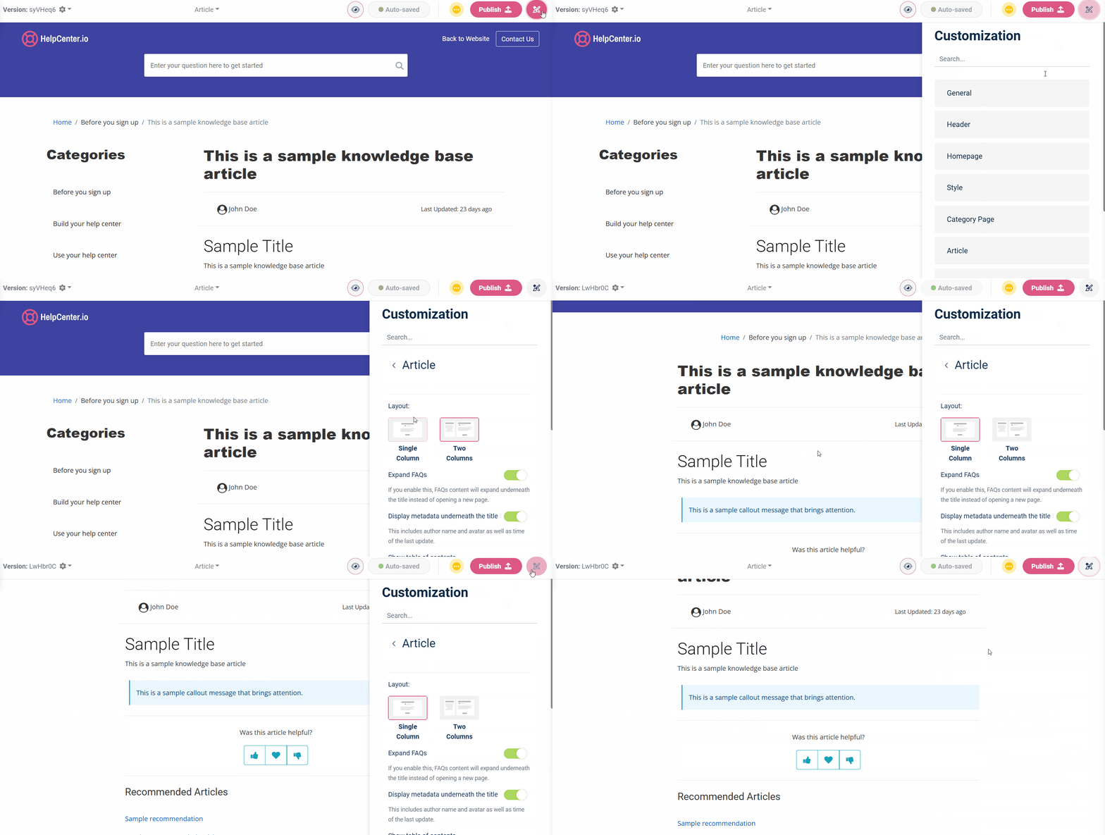
Now you have even more control over the layout of your article pages. You can choose if you would like to have 2 columns with categories displayed alongside your content or go with a single-column layout displaying only what's most important - your article. The default remains the two-columned layout, but you can always adjust this according to your requirements with a few clicks from "Article" -> "Layout" in the Template Editor:

3. Adjustable Category Page Layout
You can do the same for the category page. Decide what is the looks you would like for your category pages and choose between the available options. The different category pages layouts also come with a different way to list your articles.
Again, you have two options - our default two-column layout, or the new single-column layout which would display your articles as block items instead of simple links like in the two-column layout.
4. Block-type articles listing on the homepage
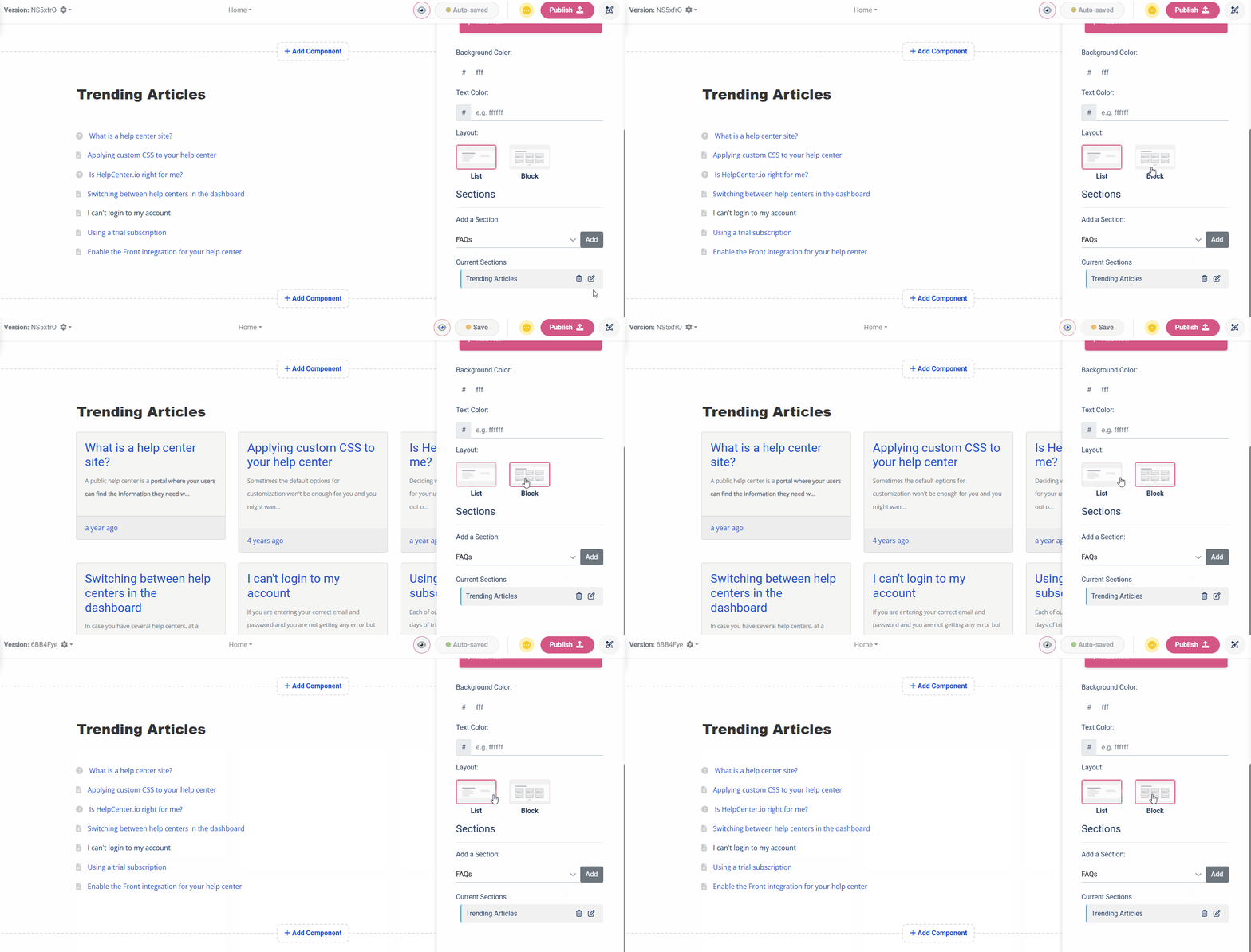
And last but not least, you can apply the same block-type styling to your articles list on the homepage of your help center. The articles section now comes with an option to choose the looks of your articles.

You can then further adjust the style of the boxes as per your requirements.
In the end, why you should pay a fortune for a third-party template when you can have the same one out-of-the-box inside HelpCenter.io included in the price of your current subscription.
So, if you did not have the chance to try it, yet, give it a try. Some of our customers are building amazing things with our Template Editor. See for yourself in our "Hall of Fame" or i.e. on our Showcase page. Sometimes, even we find it difficult to recognize the HelpCenter.io template on some of the help centers.
Overlay Search in the Article Editor
If like me, you are tired of switching between the article editor and the articles listing page of your help center dashboard, you will appreciate this one. Here's the pain. While I am onto writing something, there are times I just want to check if something has already been published, and to do this I need to go back to a different page in the dashboard.
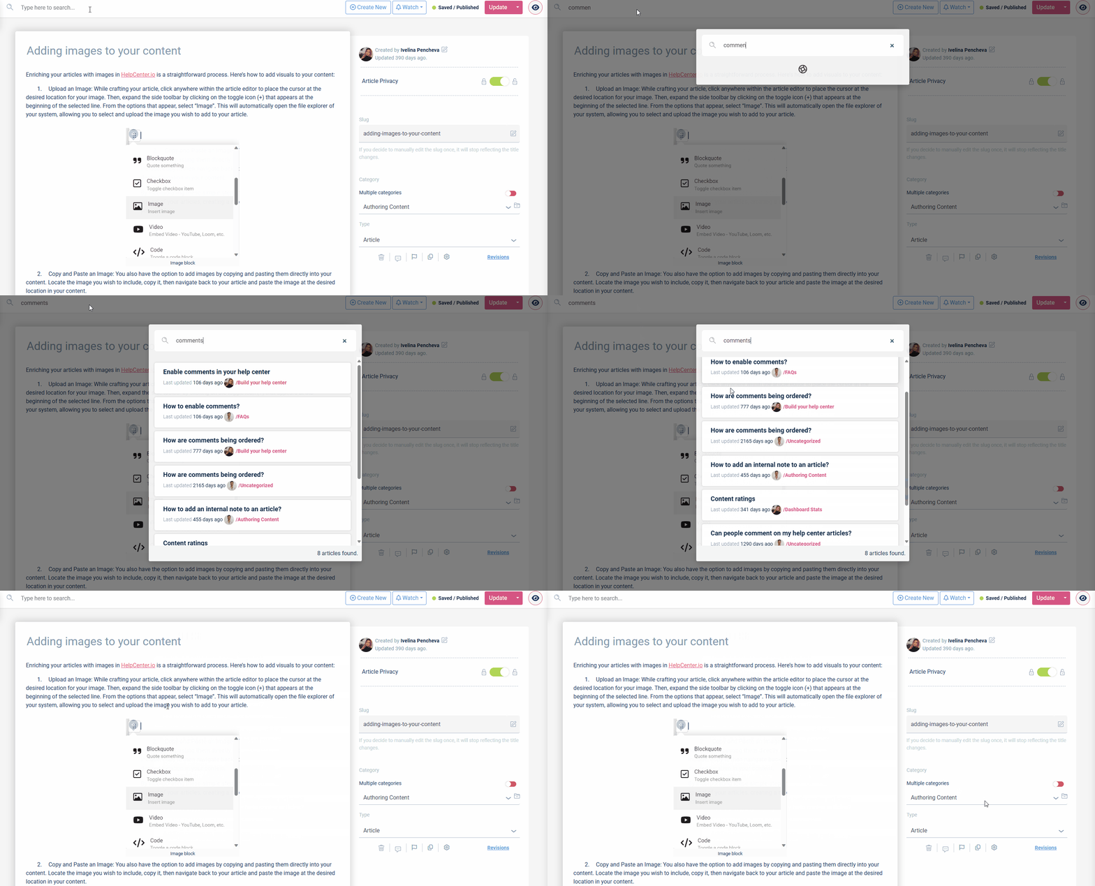
Fortunately, this is no longer the case. Our new search is now also available in article editor, too, so we can all search for articles while writing the next piece of great content. Simply use the already-familiar search bar in the top bar and you will get instant results as an overlay on the same page.

Clicking on a certain result will open the editor with the selected article in a new tab so it does not disturb your current flow.
Embed your whole help center
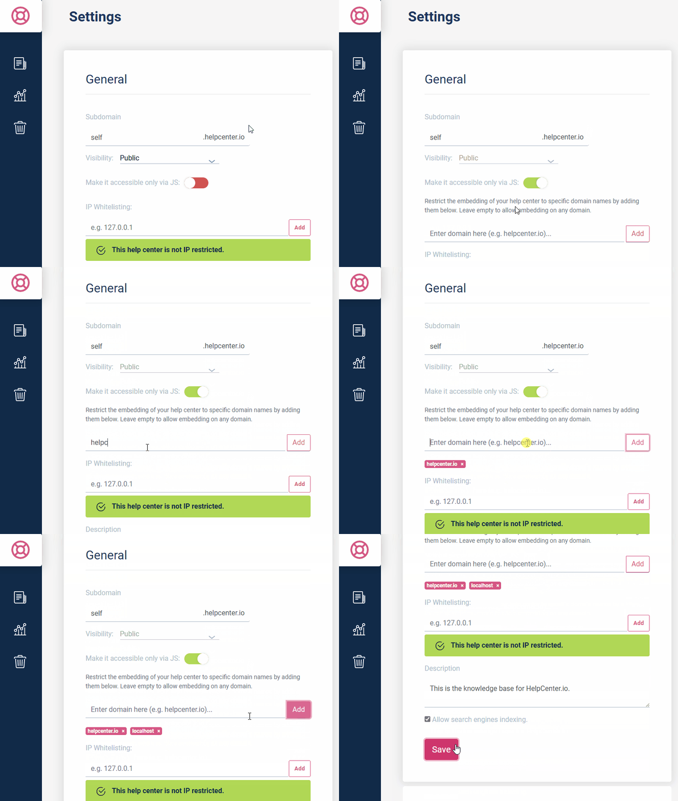
You can now embed your whole help center on your website or wherever else you need it. This gives you the opportunity to have you help center as a subdirectory/path on your own domain name instead of serving it on a subdomain. You can also easily hide it behind your custom authentication wall without going through the SSO setup.
And if you would like to have your help center completely hidden from the public eye, you can toggle the JS-only visibility on from the settings of your knowledge base. Doing so will disable your help center on the default subdomain you get with us.

You can learn more about how you can embed you whole help center in our help article.
Two Factor Authentication
Starting with 2FA using codes from an authenticator app you can now add an extra layer of security to your HelpCenter.io account. Support for SMS verification is coming very soon.
You can configure 2FA by navigating to your account settings and below "Security Settings" clicking the "Enable 2FA" button. Then, simply follow the steps to complete the setup. Do not forget to download and store your recovery codes somewhere safe.
Once you have 2FA enabled, you will have to go through a second step of your login, and enter a one-time code from your configured Authenticator app.
FAQ sections multi-language support
So far, our embeddable FAQ sections did not allow you to easily switch between the different languages that your knowledge base supports. With this update you get a complete multi-language support for all your embeddable FAQ sections, too.
Setting the lang parameter on your widget, as usual, will also localize all your FAQ sections throughout the page.
Security updates and bug fixes
Not only with this update but as always, lots of smaller security fixes, general system improvements and bug fixes were introduced inside HelpCenter.io to make your knowledge base building experience even smoother, faster and more secure.
We are also listening for your feedback, and I would love to learn what you do you think about our latest update and about HelpCenter.io in general so don't hesitate to reach out to me.
Until next time.
