Discover the unlimited possibilities with our latest release

When I started HelpCenter.io, I had that great vision for the content editor. I reasoned that the content editor in an app like this is the centerpiece of the whole user experience. Ultimately, you will spend most of your time working with the editor, polishing your content.
However, as usually happens, things did not initially turn out exactly as expected. Here's a bit from the backstory.
The backstory
Unfortunately, the first editor had a weak foundation. The base was flawed, thus the whole editor experience.
Our old editor was extremely limited in terms of content schema, which, in the end, did not allow us to build some of the essential things a good editor has, with probably the most important one that got asked for a lot. I mean it. A lot. Tables.
The ask for tables went so far that since, at that point, we did not have enough dev capacity to start building a new editor, we had to find another way. We quickly purchased a license for a popular WYSIWYG editor and offered it as a second editor. It had support for tables but was available only to some of our customers. However, it performed a lot worse in other vital areas.
So, we were left with two almost identical but different editors for almost a year. When somebody wanted tables, we provided tables by enabling the alternative editor. Otherwise, everybody else was using our default one.
As you might expect, this setup was very hard to maintain. The team also hated the markup that the alternative WYSIWYG editor generated (and allowed pasting). This flawed markup made it very hard for us to offer style consistency to everybody across the articles.
The present
You could guess I am thrilled to announce this is history. Our ONE AND ONLY content editor was released a month ago and is going stronger than ever. It features tables and everything you might need to write good help content. Apart from this, the editor is so flexible that many more goodies are coming in the upcoming months.
On top of that, apart from the editor, another very requested feature now also comes bundled with your HelpCenter.io experience. Private categories. This way, you can have a public help center for your users with whole categories that would appear only to your team once they log in with HelpCenter.io. I am pretty sure you can think of many other cases, too.
Here's a brief intro to what you should expect from our editor and private categories.
Our new editor
Our dev team had spent considerable time working on an entirely new editor. At first sight, it looks and feels the same as the old one, but it has a better and more flexible architecture. One which we can extend and polish as much as we want and you might need.
Due to the more flexible architecture, we can now provide you with support for tables, better support for embedded content, and even more types of blocks to enrich your help content.
What you will find in the new editor?
You have two types of content in the editor - inline and block. With the inline styles, apart from the standard bold, italic, underline, strikethrough, code, and link, you can now adjust the color.
Adjust the color of your text
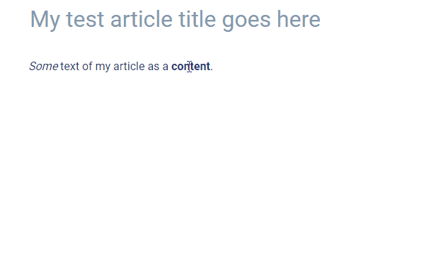
A frequent use case for the color adjusting is for customers wanting to display their brand name using the original brand colors so the brand name would stand out in the content.
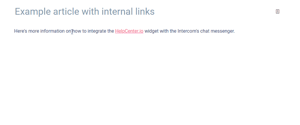
Same quick search and link of other articles
With links, you could have an external link that would open in a new tab by default, but you can also still easily search for and link internal content without having to know the URL of another article from your help center.
Support for Markdown and auto-links
You can now use Markdown to quickly adjust the style of text and insert links or images. The new editor also automatically detects links, so if you type something that looks like a link, it will get transformed into a link without you having to manually do anything else.
Better support for embeddable content
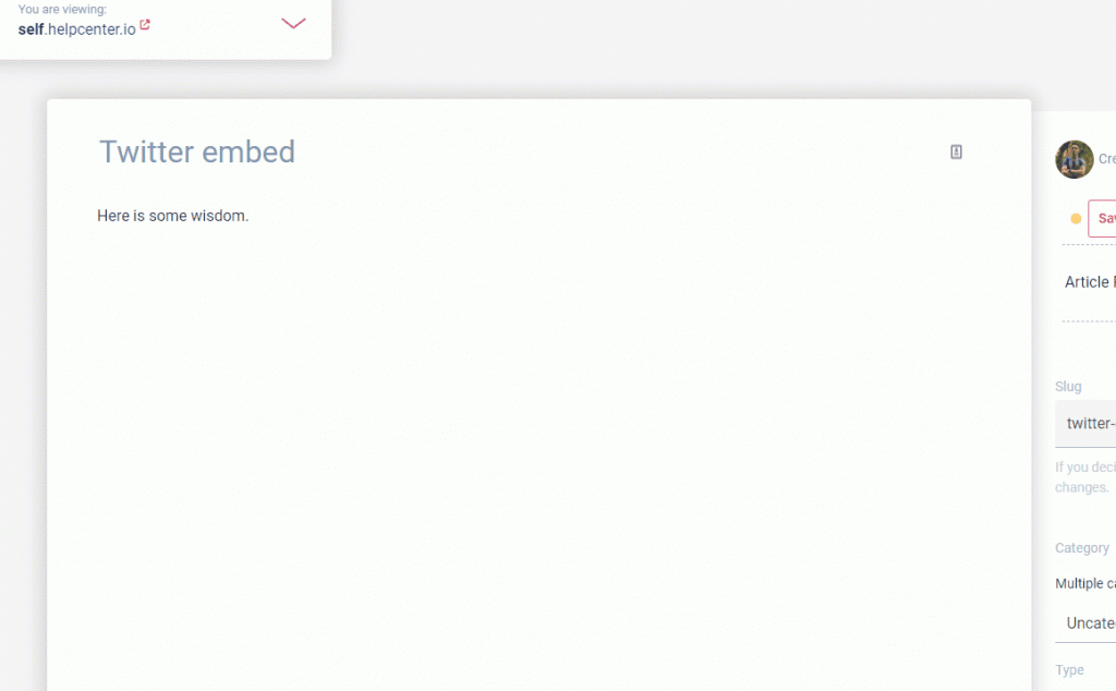
Now you can embed all kinds of rich content that you have the HTML code for, and they should look as intended. For example, the embedding of tweets or gists from GitHub was something beyond the capabilities of the old editor. Not anymore.
Tables
Probably the most worth mentioning from all of our new block types are the tables. You do not have to use the embedded component anymore in order to create tables for your content. You have tables built-in with all the other block options available in the side toolbar.

You can easily add new rows and columns, split or combine cells, toggle header row and column or delete the whole table with one click from the new context menu that appears when the text caret is inside a table.
Zoomable images
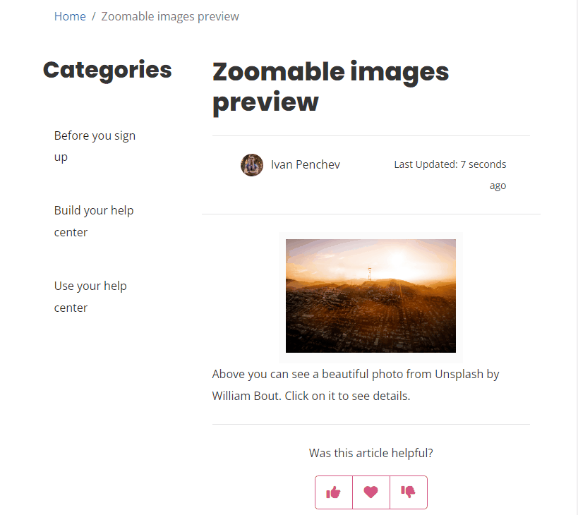
Sometimes you may want to allow your readers to enlarge specific images in the content. For example, there could be text that is hard to read when the image is part of the content, or it could just be a beautiful photo that deserves to be seen in a larger size.
Whatever the case, here is where zoomable images come into place. With the new editor, you could make an image enlarge with a click.
To allow this for a specific image, click on it to select it in the editor and toggle the new magnifying glass option.

This action will make your image zoomable, so it will smoothly zoom in if somebody clicks on it without interrupting the flow of the article. Scrolling further will hide the image, allowing the user to continue reading.
FAQ sections
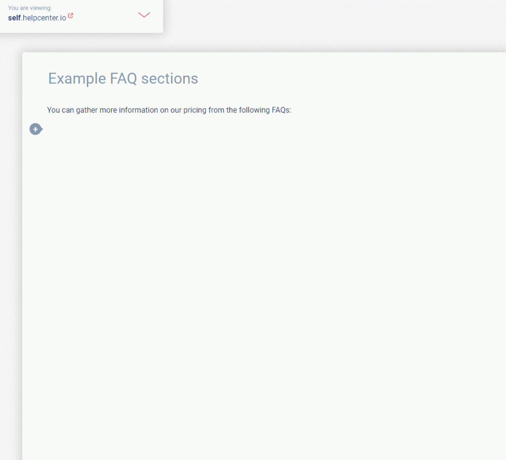
With HelpCenter.io, you could easily replace all your static FAQs on your website with dynamic ones built from and reflecting the content of your help center.
But why can't you have these inside your articles? Nothing can stop you now. With the FAQ section block type, you can arrange your help center FAQs into various sections and place them right into your content as clarifying information.
Article block
The article block will allow you to guide your help center readers to other articles in your help center that are worth looking at. The article block is still a link, but apart from the simple article links, the article block is a lot more noticeable and will put emphasis on the linked article.

You may want to use this at the end of your articles and lead your customers to other information that they might find helpful. This is different from our automated "Recommended Articles" section you could enable.
By having both Recommended Articles and articles blocks inside your content, you could use manual guiding together with our automated algorithms to offer the most helpful content.
Internal notes
Last but not least is an option that was also available for quite some time to the users of our default old editor but with many limited possibilities. This was also not available to anyone using the alternative editor with tables support.
I am speaking about the internal notes. Have you ever wanted to place something in your articles that only your team members could see? You can with internal notes. The internal notes are shown only to your and logged-in team members inside the editor, in your help center, and inside our plugin for Front.
Internal notes allow you to have some private information that is available only to your customer support team inside Front that will guide them to a successful resolution of a customer issue.
Here is how you can add an internal note.
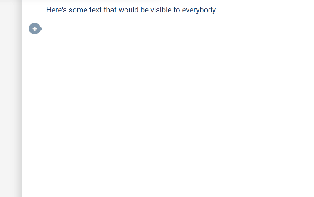
What is new with the internal notes, I hear you ask? Previously, internal notes could contain only inline content - meaning text. Now, you can place all types of rich content into your internal notes. This includes images and Loom videos, right. Imagine how helpful your content could now be, not only to your customers but also to your customer support team.
What will you not find in the editor?
Something you will not find in the editor at this point is the ability to adjust the size of the text. We would like to keep some consistency across the article styles in all help centers, and sometimes offering too much freedom might lead to not so pleasant-to-the-eye help center experiences. This is why text size and other text-related options are something beyond what is offered by our editor.
For example, you could easily adjust the font that is used in your help center from our Template Customizer but changing the font only of a specific text in an article might turn in the wrong direction.
Everything else in terms of rich content blocks could be expected in the future.
The private categories
We are always working on the most frequently requested features. The things that you need and not the things that we think you may find cool. This has contributed a lot in recent years to HelpCenter.io, being able to help countless customers in the past few years successfully build the help center they need.
Such a requested feature is the private categories. There were many times a customer would ask us if they could hide whole categories from the public so they get a hybrid help center - one that is public and all of their users could read but also offers hidden information to those who could authenticate in some way. This is especially helpful to those who implement SSO (single sign-on).
You can now have private categories in your knowledge base created with HelpCenter.io. You will discover a new option in the "Category Management" modal labeled "Share With":
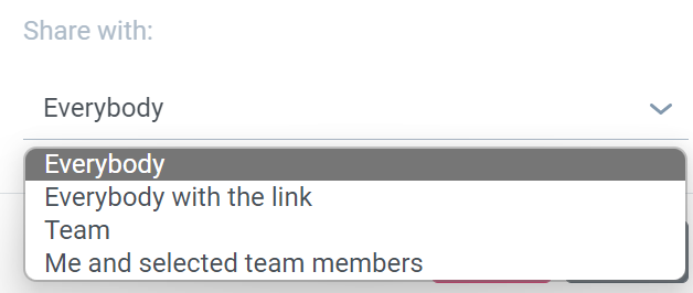
You have the option to share a category with "Everybody", thus making it public as the name suggests. Public categories will also be listed on your homepage. If you would like to keep your category from being listed anywhere in your help center but still be accessible through a direct link, you could go with the "Everybody with link" option.
Another option is to share a category with your whole team so only people with accounts who were added to the team of your help center will get access. And finally, the most restrictive setting is to keep the category to yourself and several other team members that you select (or none).
As always, stay tuned for more
We have prepared many more things for release until the end of this year, so even though we cannot always find the time to post a formal update here and announce, stay tuned for more great features to improve your help center and your HelpCenter.io experience.
If you haven't taken the chance, yet, you could try HelpCenter.io for free. Just sign up here.


