
Introducing Template Editor v2: Thousands of Designs, No Code Required.
Build thousands of unique help center designs with Template Editor v2. Customize every page without code, preview changes exactly as visitors will see them, add dark mode, and manage everything from our redesigned mobile-ready dashboard.

Two years ago, when we last upgraded the help center template editor, we had one specific goal in mind: make it easy for anybody with zero technical knowledge, and zero extra budget to create a beautiful, branded, and modern help center.
It all started with the idea of building a component-based help center builder similar to popular no-code website builders like Webflow, but also different, given the complexity those tools come with and the overwhelming number of options they offer.
And, I must say, the goal we set was partially successful.
The three issues with our old template editor
Yes, I must admit that, while it was around, we saw hundreds of beautifully built help centers made possible by our template editor.
The old editor was not a bad tool. It had an instant preview. You could click the text on your page and edit it right there. You could click a section and jump directly to its settings. You could set colors and backgrounds for each section, add custom CSS, and save your own templates. I am not going to sell you a rebuild by pretending that the tool you have been using for years was primitive, because it was not, and plenty of you liked it.
Unfortunately, we did not engineer it properly from the start, and the cracks became more apparent with every new feature we added.
Read on to see what I mean.
1️⃣ It became hard to navigate
As we kept extending the editor with more and more options—based on all your valuable feedback and our desire to let you adjust the look of your knowledge base even further—it became hard to navigate and increasingly confusing.
How did we try to fix that? We eventually introduced a search bar into the options sidebar, but it did not help much. With so many options and controls spread across so many different sections, the editor felt confusing and difficult to navigate even for me.

2️⃣ It was based on a legacy framework
The second issue with our template editor? It all started back in 2017, when Bootstrap 4 was still a thing.
As our user base grew, technologies changed substantially and Bootstrap 4 was eventually deprecated. But with all the help centers already built on that template—and all the custom CSS and HTML that went into some of them—we simply could not imagine how to release a completely new template and editor for new users while also making it easy for every existing customer to migrate on their own pace without much friction.
We did not want to leave anybody stuck on the legacy template, and we did not want to force anyone into a redesign they had not asked for.
That challenge kept delaying the update, but it also forced us to build a much better migration path.
3️⃣ The preview was rendered separately
The preview you saw inside the dashboard while adjusting your help center was instant, and that was one of our main goals when we released the previous template editor.
But even though it was instant, it did not always reflect exactly what you would see in your actual help center because it was rendered separately. The live preview was a mock. It was not your real, live help center.
That meant we sometimes ended up with a customization control that worked perfectly in the preview but made no visible difference in the live help center—or the other way around. All of this made the editor increasingly confusing to work with and, over time, undermined trust in the preview.
Once you have been burned twice, you stop trusting it. Then you start publishing and checking every change in another tab, which defeats the entire point of having a preview.
🎉 We have the solution now
I am happy to say that today we are officially releasing the solution: the most advanced template editor so far - Template Editor v2.
It is a complete redesign of both the template and the editor, built from the ground up using everything we have learned over the past eight years. It gives you even more freedom to customize your help center while making the entire experience dramatically simpler, faster, and more reliable.
Instead of adding more controls to an already complicated interface, we started over. Every section has been reorganized, every option reconsidered, and every interaction redesigned with one goal in mind: making it effortless to create a beautiful, high-performing help center.
Most importantly, the editor now works directly with your actual help center. The preview is no longer a mock—it is your real help center. What you see while editing is exactly what your visitors will see once you publish, giving you complete confidence that every change will look exactly as expected.
All new users will now start with Template Editor v2 by default.
What about existing customers? I already mentioned that one of the reasons we kept delaying this update was that we did not want to leave existing customers stuck on the legacy template editor. We wanted to find a way for you to move your help center over cleanly, whenever you decide to.
And we did.
If you are currently using the legacy template editor, you will now see a small nudge in the preview that says Try the new editor. Clicking it will run our automatic migration tools behind the scenes and make a best effort to bring your existing template customizations into Template Editor v2.

Of course, not every change will always translate cleanly into a completely new template. That is why you will first get the chance to preview your migrated help center and adjust it further inside Template Editor v2. Your live help center will continue serving the previous template until you click Publish in the new editor.
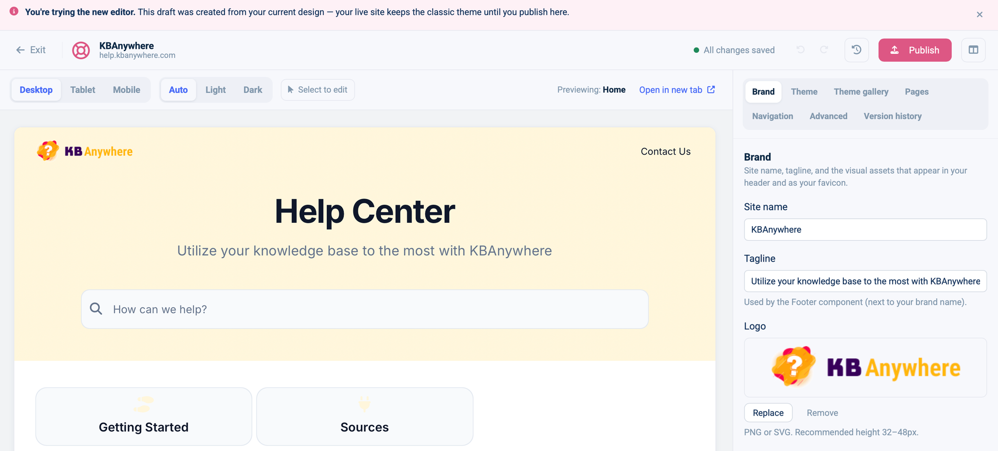
Clicking Publish will also show you a confirmation screen, so you can make absolutely sure you are ready before switching fully to the new template.
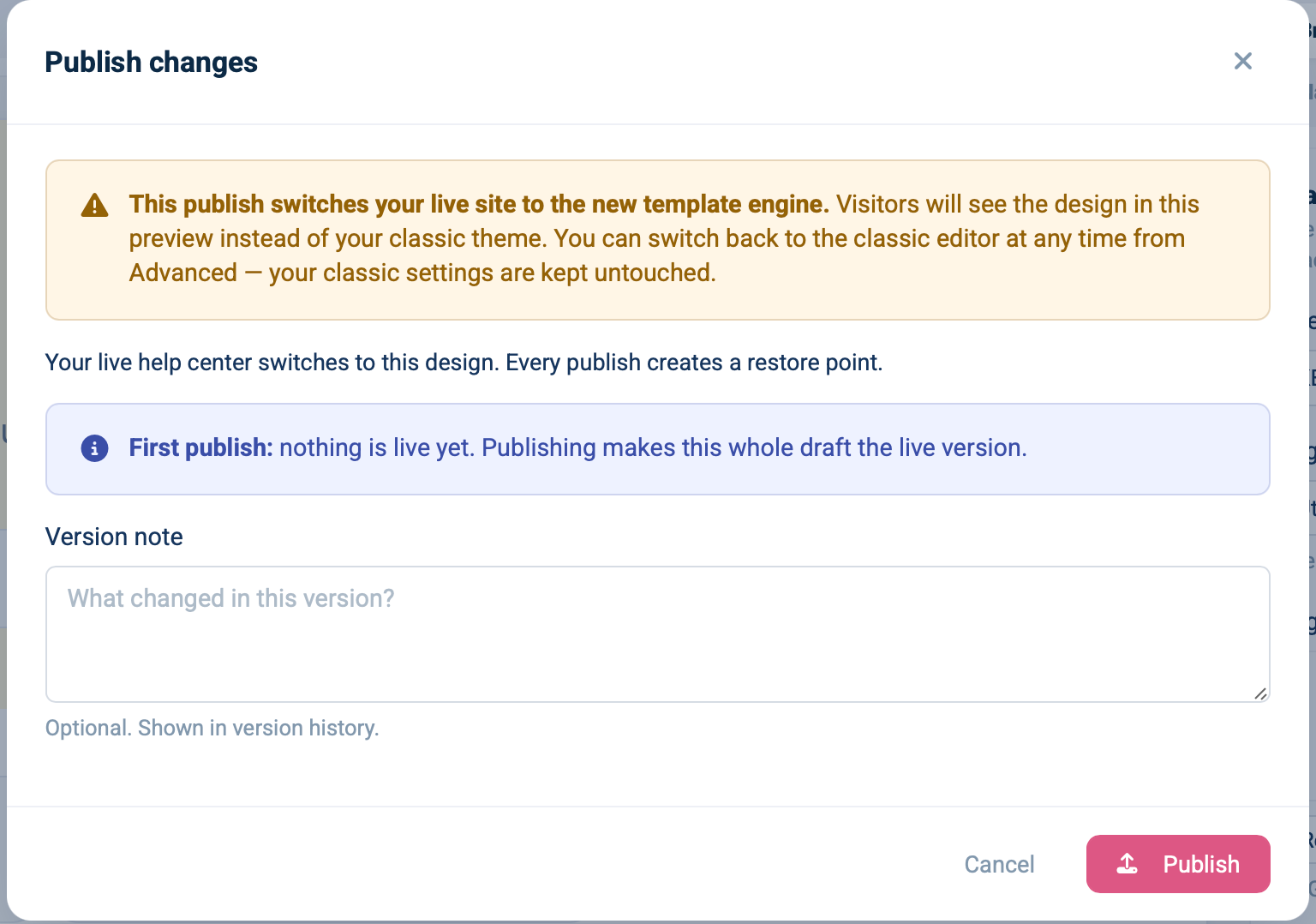
And here is where the enhanced preview shines the most. As you use the controls in Template Editor v2, every change will match what your live help center will look like because the preview uses the same template and renderer as your published help center—unlike the mock in the previous version.
If you would like to understand what else has changed, read on. If you would rather just try it yourself, log in to your HelpCenter.io dashboard and navigate to the Template Editor. Or, if you have not had a chance to try HelpCenter.io yet, sign up for a 14-day free trial.
🎨 Template Editor v2
Every page, not just the homepage
If you take one thing from the template editor rebuild, take this one. It is the change I am proudest of, and it is one of the things you asked us the most.
In the old editor, the homepage got the good treatment. It had the fullest set of options and the most room to arrange things. Your article pages, category pages, and search results did not. They were customizable, but not equally so.
And if your help center's real traffic lands on article pages—which it does—that is exactly backwards. You were tuning the page people see least.
In the new editor, every page type is built in the same way, using the same parts and with an adjustable layout. Your homepage, category pages, article pages, search results, contact page, and even your not-found page all share the same structure and regions you can adjust as you wish.
Whatever you can do to your homepage, you can now do to an article page. There is no longer one first-class page and a collection of second-class ones.
That might sound structural and a little dry. In practice, it is the difference between a help center that looks designed on the front page but generic everywhere else, and one that feels complete and consistent wherever someone lands.
The preview and the real thing finally agree
We fixed the old preview problem at the root instead of continuing to patch the gaps.
The new preview does not rebuild an approximation of your page from a separate set of components. It renders the real page through the same renderer that serves your published help center and shows you that.
What you are looking at is your actual help center, not a mockup of it. When you change a color or a spacing value, the preview updates as soon as you finish the change—and it updates correctly.
That is the whole feature: not simply a faster preview, but a preview you can believe.
Preview how it looks on your customers' phones
Inside the editor, the device preview now switches between desktop, tablet, and mobile, so you can see how a change will look for someone on a phone before you publish it.
This is about your visitors, not you. Managing your help center from your own phone—which I will get to in a moment—is about running things on the go. Device preview is about your customers and making sure the page they land on works on the device in their hands.
Many people open a help center from their phone, often while they are already in the middle of a problem. Seeing your pages the way they will see them is not a nice-to-have.
More themes, and real theming underneath them
You told us there were not enough themes to start from and that the theming underneath them was not deep enough. We addressed both.
The knowledge base templates gallery now ships with thirteen ready-made themes plus a blank slate. More importantly, there are real theme controls underneath them: colors, fonts, and corner radius are proper theme-level concepts rather than values you have to chase around the page one control at a time.
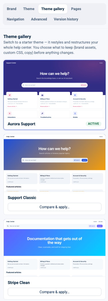
That is what makes applying a theme feel like a decision instead of a chore.
When you apply a preset from the gallery, your brand details—your site name and logo—are left alone by default. You can try every look in the gallery in one evening, and your identity survives all of them.
And the thirteen starting points are only the beginning. Once you combine themes with page layouts, nested components, fonts, colors, spacing, and all the other controls, you can create thousands of different help center designs without touching a line of code.
Less custom CSS, and components that stack
Two more things from your list, and they are related.
You were writing too much custom CSS. The old editor gave you colors and backgrounds for each section, but past a certain point you fell through to handwritten CSS to get the look you actually wanted.
The new editor puts real styling controls on every region, backed by the new theme system, so far more of what used to require CSS is now handled by a control. Custom CSS is still there, and it is still yours to use. The difference is that it is now an escape hatch rather than a requirement. It also previews truthfully and is sandboxed so it cannot leak outside your help center.
Components themselves are not new—you had some of them in the old editor. What you could not do was nest them. A hero or container could not hold anything inside it, so "arrange these three things inside this section" was not something you could really express.
Components can now contain other components, which is what makes real arranging possible and the new template editor so powerful. If you ever tried to build a layout in the old editor and found yourself fighting it, this is the thing that was missing.
And it does not look like 2014 anymore
The last two issues on your list were about the editor itself: the sidebar was confusing, and the whole thing felt dated.
Fair on both counts.
The editor has been rebuilt using our new design system, and the options are now organized around the thing you are actually editing: first the region, then the component inside it.
That "which tab was this setting in again?" hunt is what we wanted to eliminate. The new editor is calmer, faster to scan, and—finally—looks like software from this decade.
Manage your help center from your phone
Now it is your phone, from the couch. You open the article, fix the step, publish it, and get on with your weekend.
For the first time, you can run your help center from your phone. Not squint at a desktop page that has been shrunk to fit. Actually run it.
The dashboard now has a real mobile layout built for a phone: a mobile header, a navigation drawer, and controls sized for a thumb.
I keep coming back to the same picture of why this matters.
It is Saturday. A customer finds a broken step in your setup guide and writes in. In the old world, that means finding your laptop—wherever the laptop is—or leaving it until Monday.
Now it is your phone, from the couch. You open the article, fix the step, publish it, and get on with your weekend.
The on-call reality of running support does not keep desk hours, and until now our dashboard did. That is the gap this closes.
And it is the whole dashboard, not a token page or two. Your articles list, article editor, users, localization, and settings all work on a phone. So do the analytics and embeddables pages, which were the last two still using the old layout and had no real navigation frame on a phone at all.
They now sit in the same mobile workspace as everything else, so there is no page where you tap through and suddenly fall off a cliff into something unusable.
The part I am most proud of is that you can genuinely work, not just look. The article editor works on a phone, including with long articles, so writing and editing a real piece of content from your phone is now something you can do—not something that technically loads and then fights you.
Managing on the go is now a first-class way to use HelpCenter.io, not a fallback for when you are desperate.
... writing and editing a real piece of content from your phone is now something you can do.
New dashboard design
And following from the mobile app, actually the whole dashboard got a new look even on your computer.
Throughout the years, we listened to all your feedback and remembered what you were struggling with. Everything we learned from you led to the next major upgrade in your help center management experience: our completely redesigned dashboard.
You may have already noticed it if you were not at the beach and were instead working on your help center during the past week or so, as we gradually released it to everyone.
This is not just a new coat of paint. The editor is where you shape your help center, but the dashboard is where you actually live every day while running it. So we looked at how you move through it and rebuilt it around that.
Inside the already familiar shared workspace frame live all the pages you work with every day – redesigned: the articles list, article editor, trash, users, localization, and settings. Analytics and Embeddables now use the same frame too, so moving between writing an article, checking its performance, and configuring your widget no longer feels like jumping between different generations of HelpCenter.io.
Finding an article, editing it, checking what changed, how well it performs, its evolution, and managing the people and settings around it is quicker and clearer because that daily work is what we optimized for.
And it is the same workspace that carries the mobile layout. On a smaller screen, the side navigation becomes a proper navigation drawer and the actions adapt to the page you are on. That is why managing your help center on the go feels like the same product rather than an afterthought with weird arrangement of the elements.
Two things I want to make clear, because "we redesigned your dashboard" is exactly the kind of sentence that can make a busy team nervous.
First, the redesigned dashboard is the new default, but it is switchable per user. If you or a teammate would rather stay with the previous dashboard, you can turn the new design off from your own preferences, and it will affect only you. Nobody on the account is forced to switch at the same time.
Second, the legacy dashboard remains untouched and fully backwards-compatible. Every workflow you rely on will continue to work exactly as it did.
This is a redesign you can adopt on your own schedule, not a migration you have to survive.
That is the new frame. The bigger change is what we rebuilt inside it.
Redesigned articles dashboard
The articles dashboard keeps the same familiar feel but brings it into a more modern interface with much more functionality underneath—and much less opening and closing pages just to find out what is going on. And it's build with collaboration in mind.
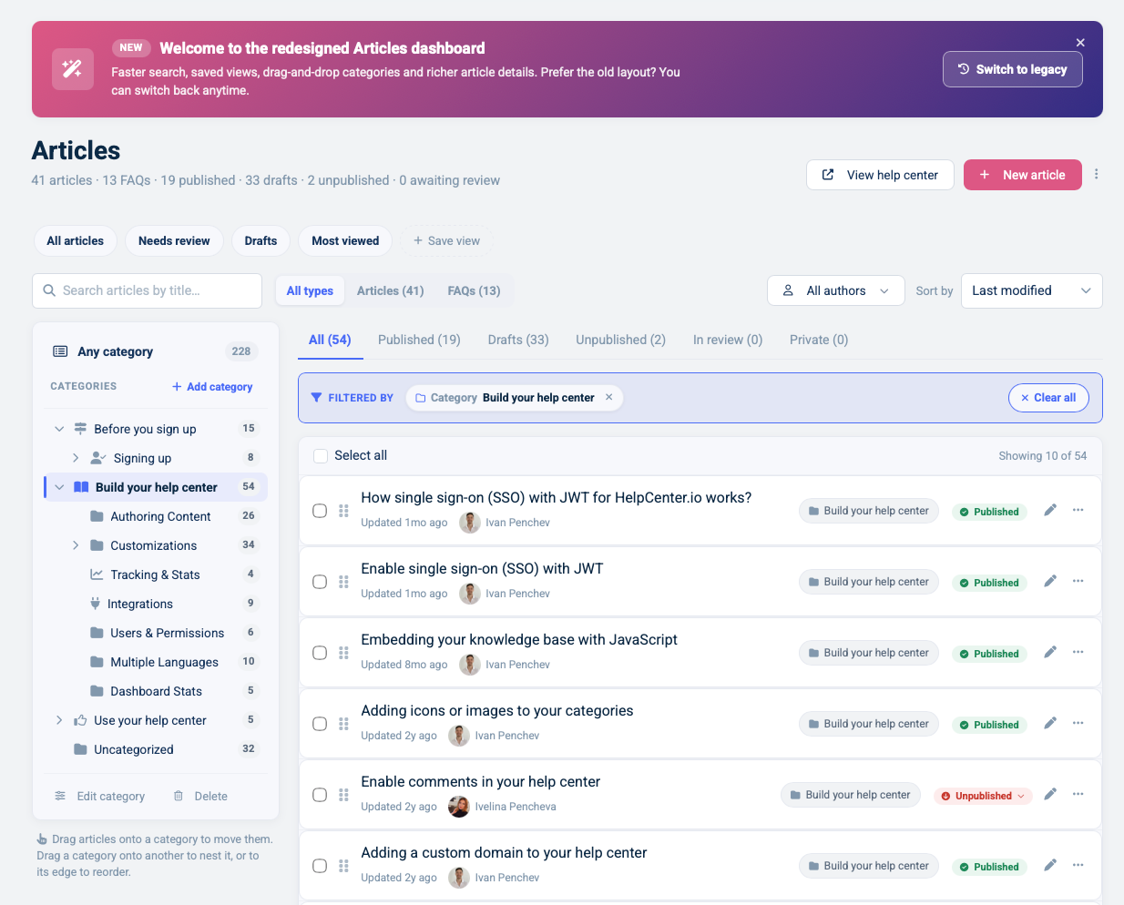
At the top, you get a useful summary of your content: how many articles and FAQs you have, how many are published, how many are still drafts, how many have been unpublished, and how many are waiting for review.
Then there are the views. All articles, Needs review, Drafts, and Most viewed are ready from the start, and you can save your own view from the search, category, author, status, and sort options you use most often. If your weekly job is "show me every draft in this category from this author," you set that up once instead of rebuilding the same filter every Monday.
Search, language, author, content type, status, category, and sorting now work together. Every active filter is shown as a removable chip above the list, so you can see exactly why an article is—or is not—showing. Your filters are remembered across reloads too, because losing your place every time you open an article is one of those small frustrations that becomes a big one when you manage hundreds of pieces of content.

Clicking an article can now open a details drawer instead of immediately taking you away from the list. There you can see its status, author, translations, recent activity, reader comments, views, helpfulness score, and average reading time. You can publish or unpublish it from the drawer, jump into the full editor, or use Quick edit when all you need is a small correction.
Categories received the same treatment. You can work from the category tree, drag categories into a new order or parent, choose an icon or cover image, control who can see a category, and manage its search metadata without leaving the articles screen. Articles can belong to more than one category, and moving one—or a whole selection—no longer means going through them one by one.
Bulk actions now stay with your selection and let you publish, unpublish, mark for review, change categories, export as PDF, or delete several articles at once. Custom ordering is still there as well, with clearer drag behavior that tells the difference between arranging articles inside a category and moving them somewhere else.
Trash is part of the same workflow. You can restore an article, remove it permanently, create a redirect for an old URL, or empty the trash with an explicit confirmation instead of wondering what just disappeared.
Article metrics are also backed by our new analytics pipeline, so the numbers behind your content continue to hold up as your library grows.
An article editor that keeps the work around the article
The article editor has been redesigned alongside the dashboard, with more room for the content itself and a much clearer home for everything that belongs around it.
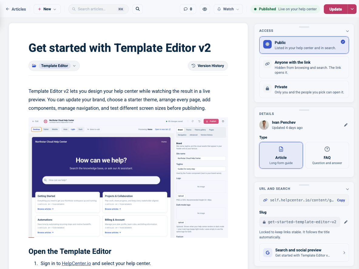
The top bar keeps the actions you need most within reach: the article's save and publish state, preview, comments, notifications, and the option to start something new. From the new article menu, you can begin with a blank page, use one of your saved content templates, or duplicate the article you are already looking at. You can also save your own articles as reusable templates and filter those templates by language.
Instead of hiding article settings across unrelated screens, the right side of the editor is made from focused cards: access and visibility, author and article type, URL and search metadata, attachments, related FAQs, and AI writing help. You can collapse and rearrange those cards to make the workspace fit the way you write.
The content tools have been reorganized too. Headings, lists, images, video, code, callouts, files, tables, internal notes, FAQ sections, related-article cards, custom embeds, and API endpoint blocks all come from one insert menu. The inline toolbar changes with what you have selected, so text, links, images, tables, and callouts show the controls that make sense for them instead of every possible control at once.
Comments are now part of the editor rather than something you have to hunt for after writing. Team notes and reader comments are separated, internal comments can be attached to highlighted text, and resolved conversations can be closed without removing the article context around them. With presence detection, the dashboard can also show when a teammate is already editing an article, which is a much nicer way to avoid writing over each other.
A better translation workflow
Localization now feels like part of the editing experience instead of a separate corner of the dashboard.
Every language appears in a clear language bar above the article, and each one tells you its real state: default, live, draft, or not translated. You can move between languages without leaving the editor and decide explicitly when a translation is ready for readers.
If auto-translation is available on your plan, AI first prepares a draft for you to review. Nothing is applied until you accept it, and nothing becomes visible to readers until you release that language. I care about that distinction. Translation can save time without taking the final decision away from the person responsible for the content.
The redesigned Localization page gives you the wider view: all of your languages, the percentage of articles translated into each one, and a searchable list of the interface phrases used throughout the public help center. You can add or remove languages, change the default language with a clear choice about what happens to the old content, and edit interface text in the language you are working on.
And because both the editor and Localization page work on mobile, you can correct a translated article or interface phrase even when you are away from your desk.
Enhanced FAQ support
FAQs are now first-class content rather than something that lives off to the side.
The articles dashboard can show articles and FAQs together or filter either type on its own, with a clear FAQ marker in the list and the same quick-edit workflow for a short answer. Inside an article, a dedicated Related FAQs card lets you attach an existing FAQ or write a new one without leaving the editor.
From that card, you can edit, publish, unpublish, or detach a related FAQ. If the source article changes later, HelpCenter.io can mark the FAQ as needing review so an answer does not quietly drift out of date. AI can also draft possible FAQs from an article, but they arrive as drafts for you to review rather than publishing themselves.
You can then use FAQ sections in the article editor, the widget, and Template Editor v2 to place those answers where they are most useful and style them as part of the same design system as the rest of the page.
More AI capabilities
The redesigned article editor is also where our new AI writing tools live.
Select a piece of text and AI can propose a clearer version, fix its spelling and grammar, make it shorter or longer, simplify it, or bring it closer to your brand voice. From the insert menu, it can continue from the cursor, draft a new section from a short prompt, turn the article into a concise introduction, or suggest FAQs from the content you have already written.
The AI card around the article can draft a meta title and description, suggest a cleaner URL slug, write missing alt text for images, translate the article, and check its overall structure and clarity.
The important word in all of those sentences is propose. Suggestions appear for review first. Selected text is not replaced until you accept the replacement, generated sections stay as reviewable drafts, and AI-created FAQs remain unpublished until you decide they are ready.
We have also improved the structured and machine-readable parts underneath your help center, including JSON-LD and an llms.txt surface. This helps search engines and AI assistants understand your published content without requiring extra work from you.
Users, settings, analytics, and embeddables in the same workspace
The rest of the dashboard received more than a new frame too.
User Management now separates active team members from pending invitations, lets you search by name or email, and makes roles clear: admin, editor, translator, or viewer. You can change a role directly, resend or revoke an invitation, and see the seat limit for your plan before an invitation fails.
Settings are arranged into focused cards instead of one long form. Your help center's address, description, visibility, password protection, widget-only access, IP restrictions, allowed embedding domains, and search-engine visibility sit together. Redirects are searchable, integrations have their own home, API keys can be created with a clear scope, and custom domain and single sign-on setup now show their status where you configure them. A persistent save bar also makes it very hard to forget that you changed something.
Analytics now sits inside the same mobile-friendly dashboard and is powered by privacy-friendly browser beacons rather than relying only on raw server logs. That gives you a cleaner view of real human engagement, with headline metrics, trends, visitor journeys, content performance, search queries, satisfaction, and—when enabled—the questions people ask AI. Filters let you narrow the view by category, language, surface, traffic type, and your own excluded IP addresses.
Embeddables also stays inside the same workspace, with the widget configuration and FAQ sections organized into clear tabs and a real preview beside the controls.
It is one more reason we rebuilt the foundation instead of continuing to patch the old template.
Three templates for three kinds of help center
The theme gallery ships with thirteen ready-made themes plus a blank slate. But a theme is not just a color scheme. It is an opinion about what your help center is for.
So rather than walk you through all thirteen, here are three shapes, each built for a different kind of team and each one you can start from today.
A help center built to teach your product
If you make a vertical SaaS product, your help center is part of onboarding, not an afterthought bolted on next to a contact form.
People land on it mid-task, often mid-frustration, and the job is to get them unstuck and leave them a little more capable than they were before.
For that, start with a docs-style layout. It puts a navigable category tree in the sidebar so the shape of your product is visible at a glance, and someone can move from "Getting started" to "Common workflows" to "API and advanced" without losing their place.
The article page handles tutorials and code well, which matters when half of your best articles are walkthroughs. A related-articles block at the bottom of each piece keeps people moving from the thing they just fixed to the next thing they can learn.
And this is exactly where equal customization across every page earns its keep: article pages are where this audience actually lives, and they now get the same care as your front door.
A help center your clients think they built
If you are an agency running help centers for several clients, your challenge is different. You need your own presence to disappear so each client's brand can take the lead.
Start with a brand-first, minimal layout. It keeps the navigation quiet and gives a full-width hero pride of place, allowing each client's logo and palette to carry the page instead of competing with busy chrome.
Because applying a preset is brand-safe, you can create a new client's help center from the gallery, add their logo and colors, and try another preset without worrying that it will wipe the brand details you just entered.
The footer attribution is a toggle, so the page can read as the client's own. Spinning up client number six starts to feel like spinning up client number one: pick the shape, set the brand, and publish.
And because every page is now equally customizable, you can hand a client a help center that feels polished everywhere—not just on the homepage you had time to dress up.
A help center that does not look like 2019
If you moved away from a suite like Zendesk—or you are about to—you probably want something professional but lighter, with clear navigation and fast search, that does not look like a help center built in 2019.
You are not trying to rebuild your entire support stack. You simply want the knowledge base part to look current and load fast.
Start with a search-first support layout. The homepage leads with search because that is what your customers do first. An FAQ section catches the handful of questions that drive most of your support volume, and a clear contact path is there for the cases self-service cannot cover.
The entire experience feels like a modern help center rather than a ticket portal with the lights dimmed.
When you are ready to move to the new editor, the migration tools will bring across as much of your current look as possible. You can then preview the result, make any adjustments you want, and publish only when you are happy with it. Nobody on the customer side sees a thing until you decide it is ready.
Moving over, with nothing changing until you are ready
If you are already a customer, the part you care about is what happens the day you try the new editor.
The answer is: nothing visible to your visitors until you want it to be.
When you click Try the new editor, our migration tools will make a best effort to carry over your site name, logo and favicon, colors and fonts, header and footer, search bar, navigation, table of contents, category structure, and custom CSS.
Your articles, categories, FAQ sections, translations, custom domain, redirects, and search backend are untouched by the switch because they were never part of the template. The new editor sits on top of the help center you already run.
Because the foundation is completely new, some customizations may need a little attention after migration. That is why you get a private preview first. You can inspect every page, adjust anything that did not translate cleanly, and use the desktop, tablet, and mobile previews to check the result.
Meanwhile, your live help center keeps serving the legacy template exactly as before.
Only when you click Publish and confirm that you are ready will the new template go live.
A few more things in this release
Mobile administration, Template Editor v2, and the redesigned dashboard are the headlines, but they are not the whole release. A handful of smaller upgrades landed alongside them:
- A redesigned attachments manager, so files and download chips look clean in both the article editor and the published help center.
- Article metrics backed by our new analytics pipeline, so the numbers behind your content remain reliable as your library grows.
- Automatic widget enrollment, so the on-site help widget is ready to go for every account without an extra setup step.
Small on their own, but together they round out a release that is really about one thing: making your help center easier to shape and easier to run, wherever you are.