
The Support Widget, Rebuilt to Resolve More on Its Own
Your embeddable support widget just got redesigned from the ground up. A real conversation flow, browse-by-category, AI answers that show their sources, and a brand gradient that finally themes the live widget.
Most of your visitors never open a ticket. They land on your site, hit the little help bubble in the corner, type a few words, and either find their answer or give up. That bubble does a surprising amount of your support work. So we sat down and asked a simple question: how much more of that work could this little bubble do on its own if it had a way to serve it properly?
That's what this release is about. We've redesigned the embeddable support widget from the ground up. Not a fresh coat of paint on the same panel, a genuinely new experience underneath: a real conversation flow, a way to browse your whole help center, AI answers that show where they came from, and a launcher and brand look you actually control. All of it pointed at one outcome, getting more people to "solved" before they ever reach your team.
And here's the part that makes this release land differently than a redesign normally would. With the new analytics we just shipped recently that includes information from the widget, you can finally see that outcome as a number. Everything coming together nicely.
This means when the widget resolves more on its own, you don't have to take my word for it. You can watch your self-service resolution rate move.
Let me walk you through what changed by doing a quick comparison.
What the old widget couldn't do
The previous widget was useful, but it was one flat panel doing everything at once. Search, results, the article you opened, the contact form, all stacked in a single view with no real sense of where you were or how to get back. It could show your top articles, offer AI contextual suggestions and run a search, and that was mostly it.
A few things it just couldn't do:
- It couldn't let people browse. If a visitor didn't know what to search for, there was no way to look through your categories and find their footing.
- Its AI answers had no receipts. On plans with AI search, the widget could answer a question, but it couldn't show you which of your articles the answer was built from.
- It couldn't reach out. It sat there silently until someone clicked it. No way to offer a nudge at the right moment.
- Its look stopped at the dashboard. You could pick a color, but that color only themed the preview inside your dashboard. The live widget your visitors actually saw barely reflected your brand.
None of that was broken, exactly but it just couldn't bring the most out of your help center content.
A real flow, not a single panel
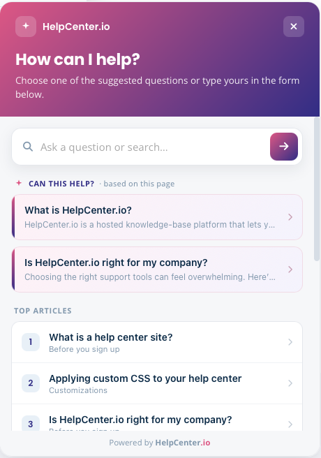
The redesigned widget moves through proper screens, the way a good support conversation actually goes: a launcher, a home, search, an AI answer, the article itself, a contact form, and a clean confirmation when someone gets in touch. Every screen has a header you can navigate back from, so nobody gets stuck or lost.
The home screen alone does a lot more than before. It opens with a search bar front and center, your most useful articles ranked underneath, and two things that are brand new:
Browse by category. Visitors who don't know the exact words to search can now look through your help center by topic, right inside the widget, and drill into a category to see what's there. For a lot of people, browsing is how they find the answer they couldn't name.
Contextual suggestions got even better. The widget can read the page a visitor is on and surface a small "Can this help?" set of articles relevant to where they actually are and what they are looking at on your website or inside your app, before they type anything. You control the label on it, so it reads in your voice.
When someone does search, results come up instantly, and if your plan includes AI search, there's a clear path from "here are some articles" to "just answer my question".
AI answers that show their work
On plans with AI search, the redesigned widget turns the AI answer into something closer to a real conversation. The visitor's question sits at the top, the answer streams in underneath, and below it the widget shows the articles the answer drew from, as small source chips a visitor can tap to read the full thing.
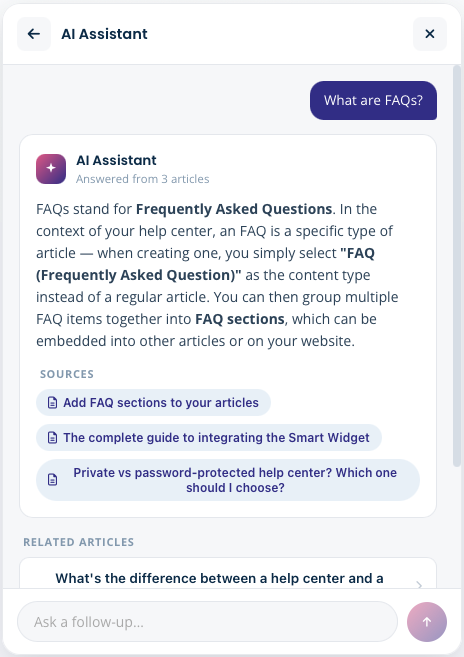
That last part matters more than it sounds. An AI answer with no sources asks for blind trust. An AI answer that shows you the three articles behind it is one your visitor can actually verify, and one you can audit when something reads wrong. There's a thumbs up / thumbs down on every answer, a list of related articles to keep exploring, and a follow-up bar to ask the next question without starting over.
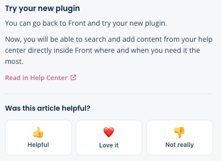
Open an actual article and you get the same idea in miniature: the full content, a quick emoji rating so people can tell you if it helped, and a small "ask about this article" bar so a visitor can pose a question against the thing they're already reading.
(AI search is included on Catalyst and available as an add-on on other plans. Everything else in this redesign ships to every widget, AI or not.)
Make it yours, properly this time
This is the part I think you'll have the most fun with, and it ties straight back to resolution. A widget that looks like it belongs on your site gets opened more. A widget that looks bolted on gets ignored. So the new customization options aren't vanity, they're the front door to every answer the widget gives.
All of this lives in your dashboard under Settings → Embeddables (yes, we renamed it, the widget isn't the only thing you can embed anymore), and every change shows up in a live preview as you make it:
- A brand gradient, not a single color. Pick a start and end color and the widget themes itself with the gradient across its launcher, headers, and call-to-action. Six presets to start from, or set your own. Your old single color still works as a fallback, so nothing breaks if you leave it.
- Choose your launcher icon. Five options for the bubble in the corner: a sparkle, a chat bubble, a question mark, a headset, or a life ring. Match it to how you want help to feel.
- A proactive nudge. Turn on a small message bubble that appears next to the launcher to invite people in, and write exactly what it says. Off by default, yours to switch on.
- Your brand name in the widget header, and the label on those contextual suggestions, both in your words.
And the big one: the gradient now themes the live widget, not just the dashboard preview. What you design is what your visitors actually see.
The options you already had haven't gone anywhere. Remove the HelpCenter.io branding, set your heading and subheading, drop in custom HTML, restrict which URLs the widget loads on, all still there, all in the rebuilt settings page.
The point of all of it: more answers, happier customers
Here's where the redesign meets the new analytics, and why we shipped them close together.
Every change above is aimed at the same thing: a visitor finding their answer inside the widget and leaving satisfied, instead of giving up and opening a ticket or even works – completely leaving your website. In your stats, that outcome now has a name. Open your Visitor Journeys funnel and you'll see a Self-served stage, plus the line at the top that reads something like "62% of visitors resolved on their own before reaching your team." That's your self-service resolution rate, and for the first time it's a number you can actually watch.
So this redesign isn't a leap of faith. Ship it, give it a couple of weeks, and look at your Self-served share. If browse-by-category and source-cited AI answers are doing their job, you'll see it climb, and you'll see the contact stage shrink to match. The widget does more of the work, your team gets the genuinely hard questions, and you have the funnel to prove it happened.
What you need to do
Close to nothing. The redesigned widget rolls out with your help center, and the embed snippet on your site does not change. Every method, option, and setting your existing installation uses keeps working exactly as before, so there's no re-install, no code edit, no migration on your end. When the redesign is live for your account, your widget simply looks and behaves like the one in this post.
The one thing worth doing is opening Settings → Embeddables afterward and spending five minutes on the new controls: set your gradient, pick a launcher icon, decide whether you want the proactive nudge. That's the difference between inheriting the new widget and making it unmistakably yours.
Go open it, theme it, and then go watch your Self-served number. If anything feels off, reach out via live chat or email. We're watching this rollout closely and we genuinely want to hear how it lands.
Until next time.
FAQ
Do I need to reinstall the widget or change my embed code?
No. The redesign is fully backwards-compatible. The same embed snippet you already have keeps working, along with every method and option your installation uses. When the new widget is live for your account, it simply replaces the old look and flow. There's nothing to migrate.
What new customization options do I get?
A brand gradient (start and end colors, with presets) that now themes the live widget, a choice of launcher icon, an optional proactive nudge bubble with your own message, a brand name in the header, and a custom label for the contextual suggestions. They all live under Settings → Embeddables with a live preview. Your existing options, remove branding, heading and subheading, custom HTML, and allowed URLs, are all still there.
Can visitors browse my help center inside the widget now?
Yes. The redesigned widget has a browse-by-category view, so visitors who don't know the exact term to search can look through your topics and drill into a category, right inside the widget. The old widget could only search and list top articles.
How do the AI answers work, and is that included in my plan?
On plans with AI search, the widget answers a visitor's question and shows the articles the answer drew from as tappable source chips, with a thumbs up / down and a follow-up bar to keep the conversation going. AI search is included on Catalyst and available as an add-on on other plans. Every non-AI part of the redesign ships to all widgets.
How does this connect to my analytics?
The redesign is built to lift your self-service resolution rate, the share of visitors who find their answer and leave without contacting support. You'll find it at the top of the Visitor Journeys section of your stats, as the "Self-served" stage and a plain-language percentage. Ship the new widget, then watch that number to see the impact.
Do I have to turn any of this on?
No. The redesigned widget rolls out automatically with your help center. The only optional pieces are the new customization choices, which you set when you're ready in Settings → Embeddables.