20 Knowledge Base Examples to Learn From in 2026 (and What to Copy)
Twenty live help centers and handbooks, captured in October 2026, grouped by type, with one specific habit to copy from each and a plan for building your own.
The fastest way to design a knowledge base people actually use is to borrow from teams that already got it right. Below are 20 live knowledge base examples, from Slack and Stripe to GitLab's handbook and a university IT service desk, each with a screenshot taken on 16 October 2026 and one specific thing you can copy this week.
A knowledge base is a self-service library of articles that answers your customers' or employees' questions without a support ticket. The good ones share three habits: they put search and real questions first, they split content by who is reading, and they keep a clear path to a person. The examples below show each habit in practice.
How we picked and checked these examples
We opened every help center on 16 October 2026 in a desktop browser at 1280 pixels wide, declined cookie banners, and saved the top of the home page as you see it below. Every phrase in quotation marks is copied from the live page that day. Help centers change often, so treat the screenshots as a dated record, not a promise of what you will find tomorrow.
We chose examples across five kinds of knowledge base, because the right design depends on who is reading:
- SaaS customer help centers (7): Slack, Stripe, Dropbox, Notion, Canva, Calendly, Figma.
- Help centers that lead with an AI assistant (3): Twilio, Shopify, Intercom.
- Marketplaces with two audiences (2): Etsy, Airbnb.
- Knowledge bases built on the help desk you might buy (3): Zendesk, HubSpot, Freshdesk.
- Internal knowledge bases and handbooks (3): GitLab, PostHog, 37signals.
- IT and service desk knowledge bases (2): University of Illinois, University of Wisconsin-Madison.
All 20 examples at a glance
| # | Knowledge base | Type | The one thing to copy |
|---|---|---|---|
| 1 | Slack Help Center | SaaS | Three real questions under the search box |
| 2 | Stripe Support | SaaS | Show how often an article solved the problem |
| 3 | Dropbox Help Center | SaaS | Name topics after problems, like "Files not syncing" |
| 4 | Notion Help Center | SaaS | A "Fix a problem" section next to the how-to guides |
| 5 | Canva Help Center | SaaS | Seed the page with questions phrased the way users ask them |
| 6 | Calendly Help Center | SaaS | Popular searches as one-click chips |
| 7 | Figma Learn | SaaS | Put new features on the help home page |
| 8 | Twilio Help Center | AI-first | A plain-language warning next to the AI assistant |
| 9 | Shopify Help Center | AI-first | "Chat with a human" on the same screen as "Ask anything" |
| 10 | Intercom Help Center | AI-first | A one-line description under every collection |
| 11 | Etsy Help | Marketplace | Separate tabs for buyers and sellers |
| 12 | Airbnb Help Center | Marketplace | One help center, five audiences, chosen up front |
| 13 | Zendesk help | Help desk vendor | A dated news feed on the home page |
| 14 | HubSpot Knowledge Base | Help desk vendor | "Highest rated articles" instead of "featured" |
| 15 | Freshdesk Support | Help desk vendor | Categories that say what is inside in one sentence |
| 16 | The GitLab Handbook | Internal | Organize by department, publish by default |
| 17 | PostHog Company handbook | Internal | Chapters that read in order, like a book |
| 18 | The 37signals Employee Handbook | Internal | Keep the change history in a public repo |
| 19 | University of Illinois Knowledgebase | IT service desk | "Top documents of the week" and "Most recently updated" |
| 20 | UW-Madison KnowledgeBase | IT service desk | One platform, many departmental KB sites |
SaaS customer help center examples
SaaS help centers serve people who are in the middle of using the product and want to get back to work. The best ones assume the reader arrived with one specific question.
1. Slack: real questions under the search box
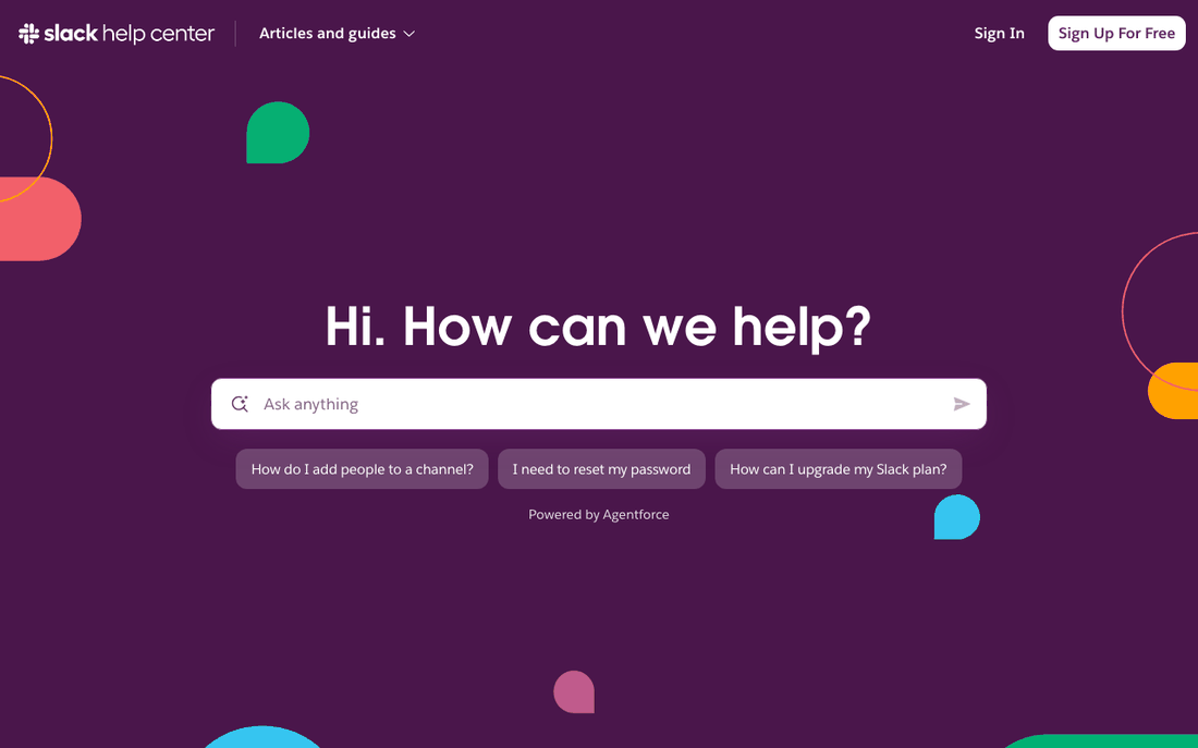
Slack's help home page is almost empty on purpose. It says "Hi. How can we help?", offers a box labelled "Ask anything", and shows three questions underneath: "How do I add people to a channel?", "I need to reset my password" and "How can I upgrade my Slack plan?". A small line underneath reads "Powered by Agentforce". There are no category tiles above the fold at all.
Those three suggestions do two jobs. They answer the most common questions in one click, and they show a new visitor what kind of question the box understands. They also cover three different needs: using the product, getting into your account, and billing.
Copy this: put your three most-asked questions, one per need, directly under your search box. Pull them from your ticket tags or your help center's search log, not from guesswork. Slack also keeps help at slack.com/help rather than on a separate subdomain, so help stays on the main site.
2. Stripe: proof that an article works
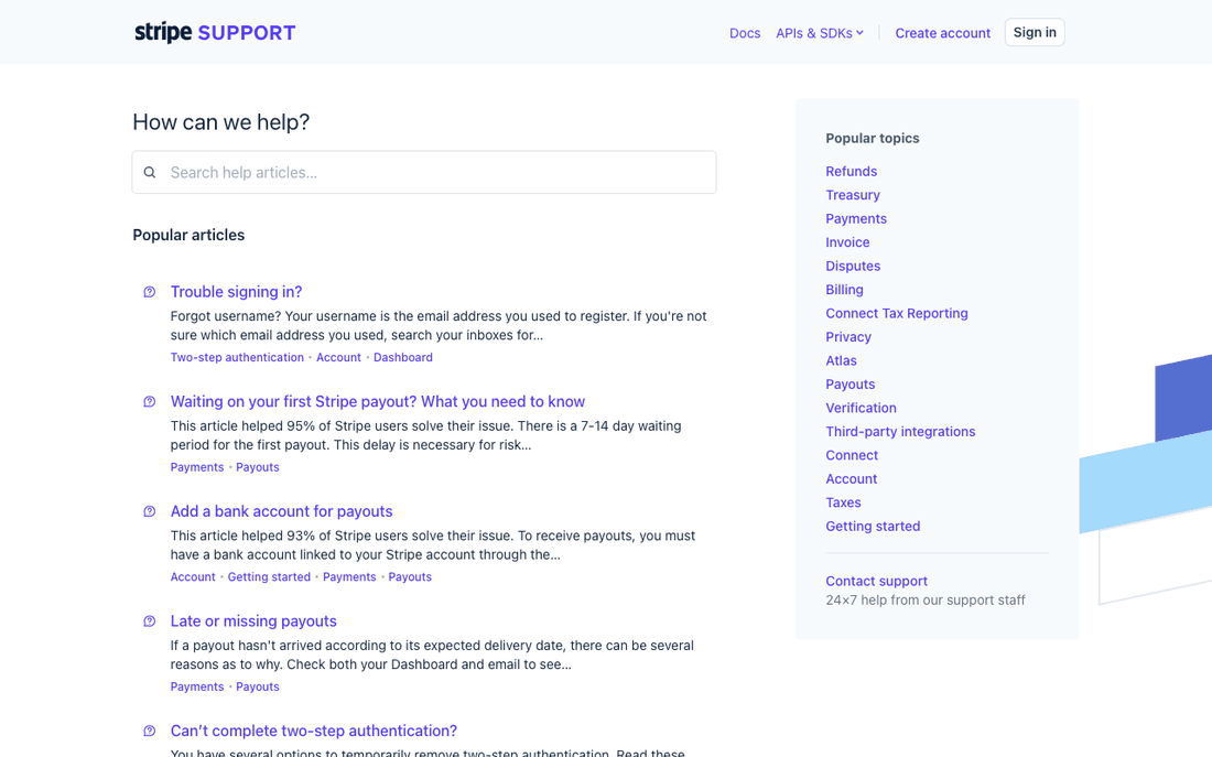
Stripe Support leads with a search box and a list of "Popular articles", and each article preview carries a line like "This article helped 95% of Stripe users solve their issue." The next one, "Add a bank account for payouts", says 93%. A column on the right lists "Popular topics" such as Refunds, Payments, Disputes and Payouts, and ends with "Contact support".
That small percentage changes behaviour. A worried user who sees that most people solved the problem from this page will read it before opening a ticket. It also tells you that Stripe measures which articles actually resolve issues, not just which ones get views.
Copy this: add a "Was this helpful?" vote to every article, and once an article has enough votes, show the result in its preview. Even without the public number, the votes tell you which articles to rewrite first.
3. Dropbox: topics named after problems
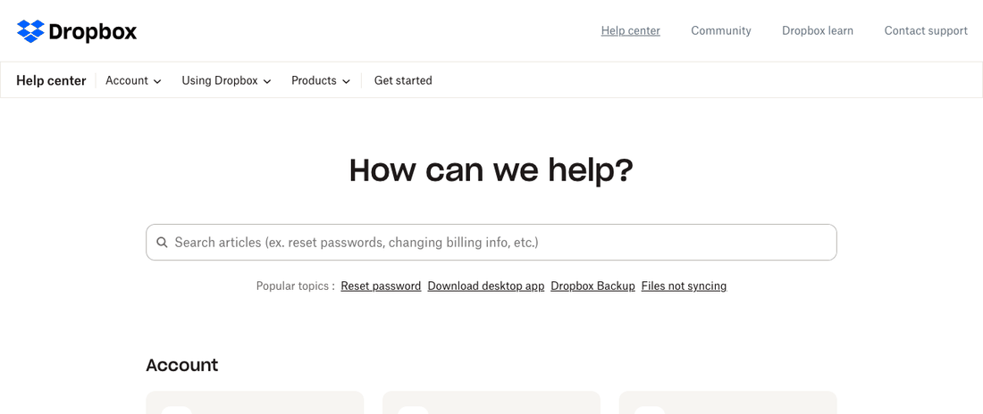
Dropbox's search placeholder suggests what to type ("ex. reset passwords, changing billing info, etc."), and right below it sits "Popular topics : Reset password Download desktop app Dropbox Backup Files not syncing". Further down, the home page ends with a short "Frequently asked questions" list and an "Other ways to get help" block that says you can "file a support ticket, and check the status of open tickets."
"Files not syncing" is a symptom, written the way a frustrated user would describe it. Most help centers would file that article under a feature name like "Sync settings", where nobody in trouble would look.
Copy this: rename at least one category or popular link after the problem people report, using the words from your tickets. Then add example queries to your search placeholder so people know they can type a full question.
4. Notion: a "Fix a problem" section
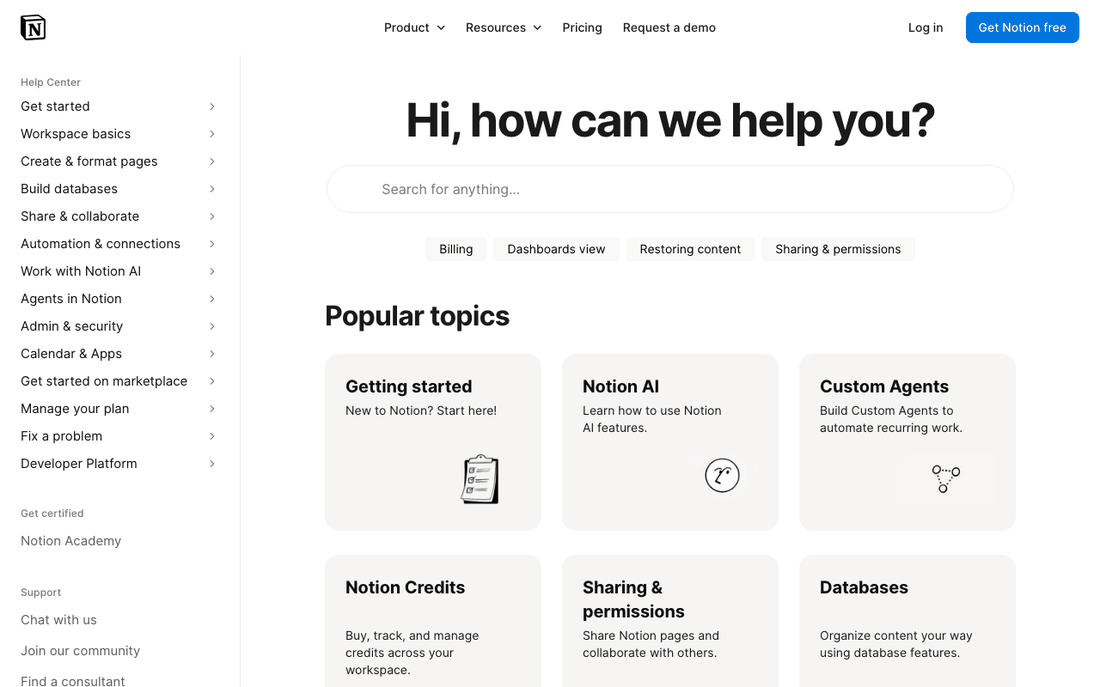
Notion pairs a search box ("Hi, how can we help you?") with a permanent left sidebar of sections such as "Get started", "Workspace basics", "Manage your plan" and "Fix a problem". The main area shows "Popular topics" cards, each with a short line like "New to Notion? Start here!", and the page ends with "Still have questions?".
The sidebar means a reader who lands on any article can see the whole map without going back to the home page. Giving troubleshooting its own section, instead of scattering it across feature guides, matches how people arrive: either learning or stuck.
Copy this: split your top level into "learn" and "fix" sections. Keep the navigation visible on article pages, not only on the home page.
5. Canva: questions written the way users ask them
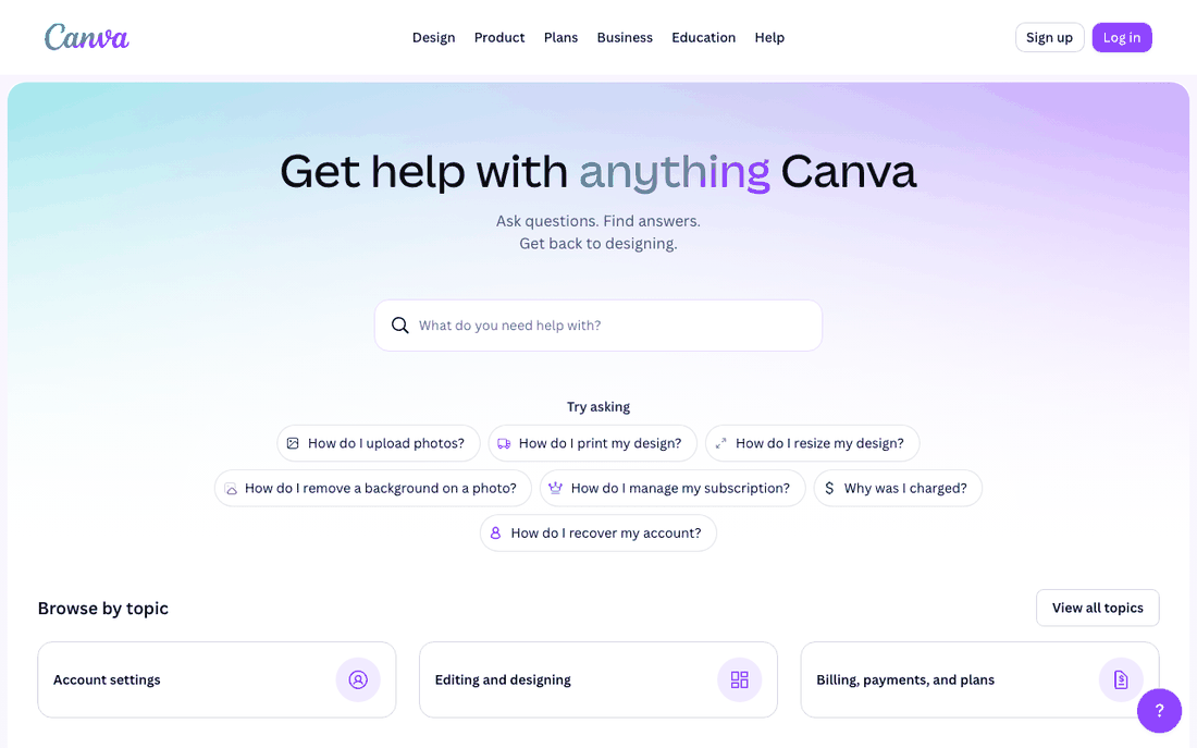
Canva's help page says "Ask questions. Find answers. Get back to designing." Under the search box, a "Try asking" block lists seven questions, including "How do I upload photos?", "How do I resize my design?" and "Why was I charged?". Only then does it offer "Browse by topic".
"Why was I charged?" is the giveaway. Nobody types "Billing policies" into a search box, but plenty of people type exactly that question, often while annoyed. Canva meets them in their own words.
Copy this: write your top article titles as the question a customer would ask, in their words, and surface five to seven of them on the home page. Our guide to writing knowledge base articles covers how to phrase those titles.
6. Calendly: popular searches as chips
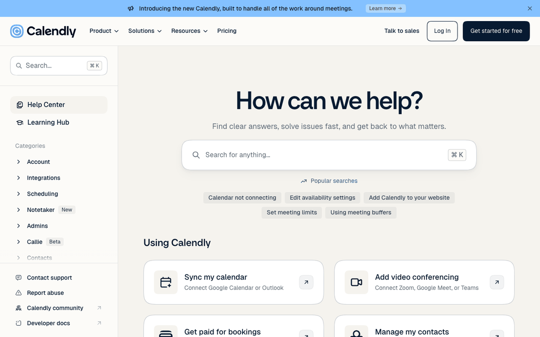
Calendly shows "Popular searches" as clickable chips under its search box, such as "Calendar not connecting" and "Add Calendly to your website", next to a left sidebar of categories (Account, Integrations, Scheduling, Admins) where categories end with their own FAQ page, such as "Integrations FAQs". The page closes with "Still need help?".
Labelling the chips "Popular searches" is honest and useful: it tells visitors these are what other people looked for, which makes them more likely to click. A per-category FAQ page is a tidy home for the short questions that do not deserve a full article.
Copy this: each month, take the five most frequent searches from your help center analytics and show them as chips. Give each category one FAQ page for its quick answers.
7. Figma Learn: what is new, on the help home page
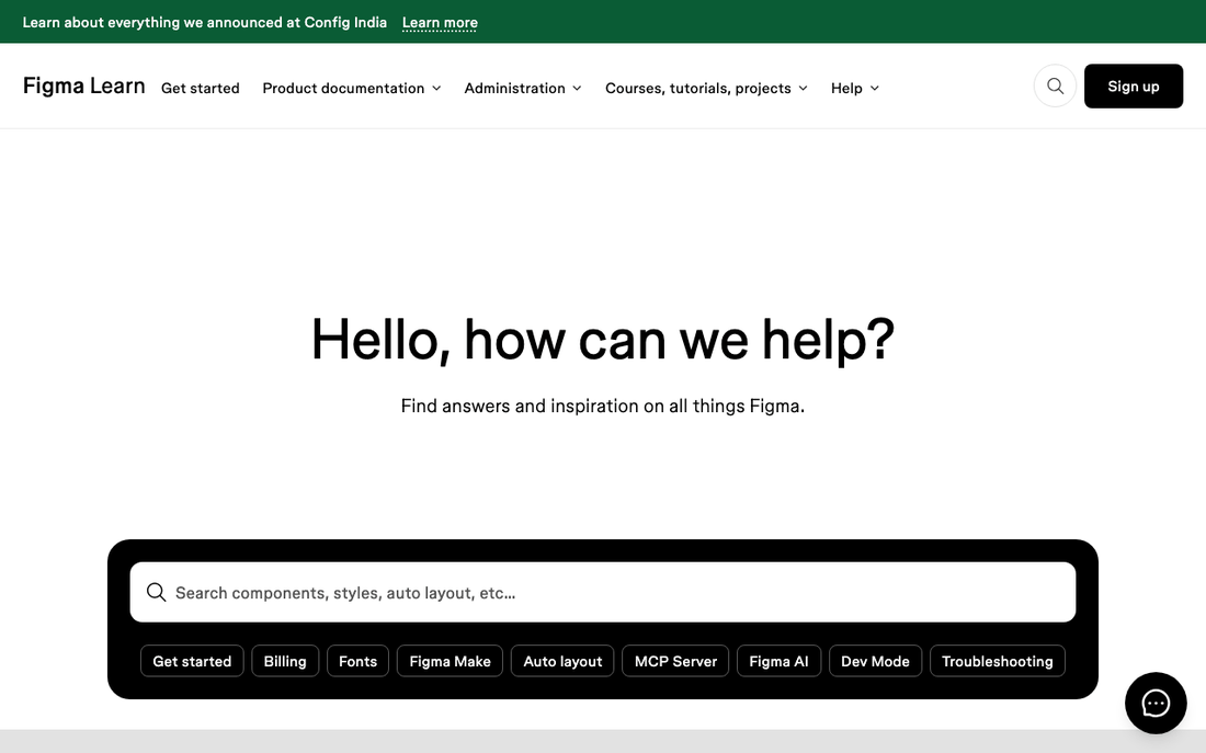
Figma calls its help center "Figma Learn" and greets visitors with "Hello, how can we help?" and "Find answers and inspiration on all things Figma." Under the search box sit topic chips, from "Billing" and "Fonts" to "Dev Mode" and "Troubleshooting". Further down, the page promotes new features and courses ("Level up with a course").
Figma ships often, so the help home page doubles as a place to learn what changed. That keeps returning users coming back to the help center instead of only arriving when something breaks. Figma Learn runs on Zendesk's help center product: its pages use Zendesk's /hc/ URL pattern and load Zendesk's assets.
Copy this: if you release features every month, add a short "What's new" block to your help home page that links to the updated articles.
Help centers that lead with an AI assistant
More help centers now open with a chat-style box that writes an answer instead of listing articles. These three show how to do it without leaving readers stuck with a wrong answer.
8. Twilio: an AI assistant with a plain warning
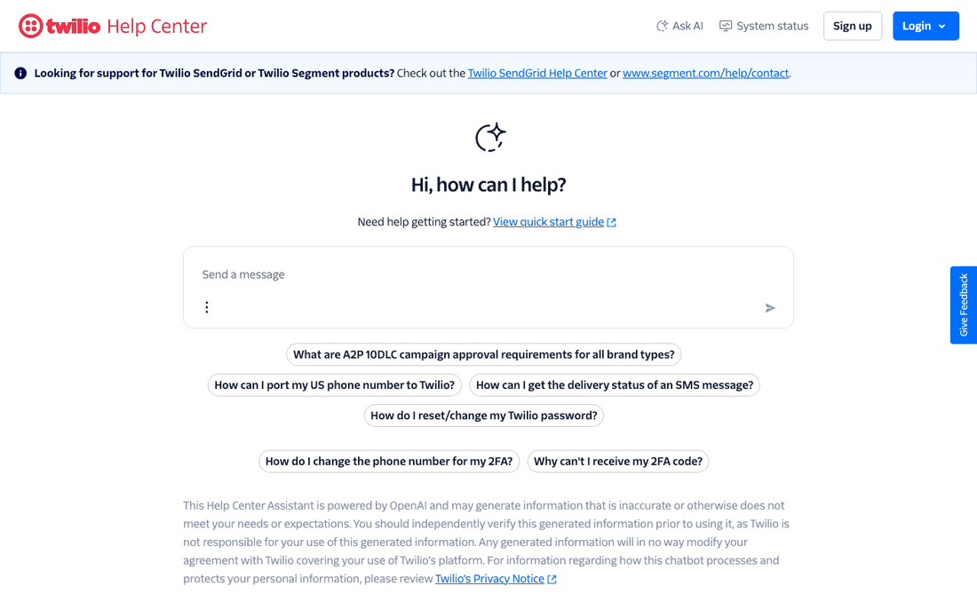
Twilio's home page reads "Hi, how can I help?" above a message box, with suggested questions such as "How can I port my US phone number to Twilio?" and "Why can't I receive my 2FA code?". Below them is a disclaimer: "This Help Center Assistant is powered by OpenAI and may generate information that is inaccurate or otherwise does not meet your needs or expectations." The top bar keeps "System status" one click away.
For a technical product, asking a direct question is often faster than browsing categories. The warning is the part most teams skip. It sets expectations, and it points people to verify answers before acting on them.
Copy this: if you add an AI answer box, say in one sentence where its answers come from and that they can be wrong, and keep your status page and a contact route visible. Before you switch one on, our checklist for AI-ready help center content helps you find the articles that would make it answer badly.
9. Shopify: a human one click away
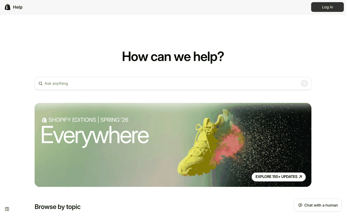
Shopify's help center opens with "How can we help?" and an "Ask anything" box, followed by a long "Browse by topic" list that starts with "Intro to Shopify" and "Migrate to Shopify". A "Chat with a human" button stays pinned to the bottom corner of the screen.
A merchant with a broken checkout does not want to negotiate with a bot. Keeping "Chat with a human" on screen while the AI box is in view tells them a person is there if the answer is not enough, which makes the self-service option feel safe to try first.
Copy this: keep a visible, honestly labelled route to a person on every help page. The Consortium for Service Innovation, which maintains the Knowledge-Centered Service (KCS) method, puts it plainly: self-service is "a customer engagement strategy"; "it is not a deflection or avoidance strategy." (KCS v6 Practices Guide)
10. Intercom: collections that explain themselves
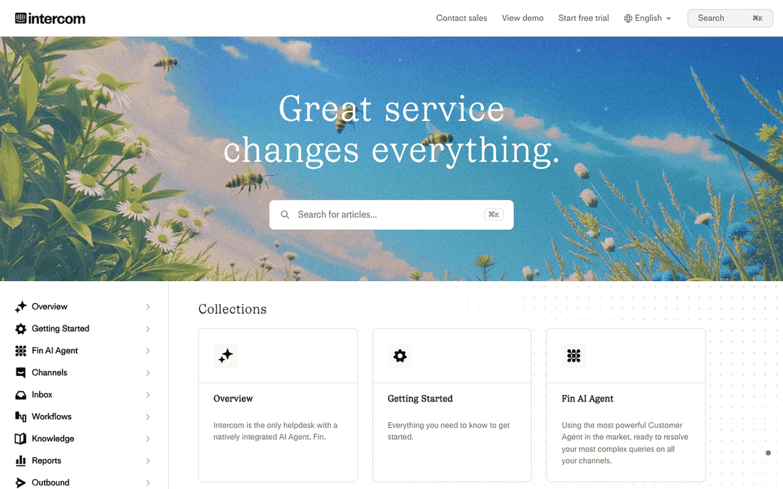
Intercom's help center opens with "Great service changes everything." and a search box, then a grid of "Collections". Each card has a one-line description: "Getting Started" says "Everything you need to know to get started."; "Inbox" says "Boosting productivity with a workspace that connects your inbox, tickets, and help center."
A collection name alone is often ambiguous. "Knowledge" or "Workflows" could mean many things; a single sentence underneath tells the reader whether to click.
Copy this: add a one-sentence description to every category, written as what the reader can do there. If you cannot write the sentence, the category probably needs splitting or merging.
Marketplace knowledge base examples: two audiences, one help center
Marketplaces have at least two kinds of reader with different questions. The two below make visitors pick a side before showing them anything else.
11. Etsy: buyers and sellers get separate tabs
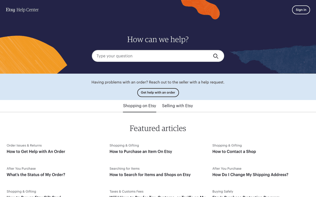
Etsy's help home page asks "How can we help?" and then answers the most common question before you type it: "Having problems with an order? Reach out to the seller with a help request." Two tabs, "Shopping on Etsy" and "Selling with Etsy", switch the featured articles, which include "What's the Status of My Order?" and "How Do I Change My Shipping Address?". Like Figma, Etsy's help center runs on Zendesk.
That banner routes the biggest category of buyer problems to the person who can fix them, the seller, before it reaches Etsy's own support team.
Copy this: if one question dominates your tickets, answer it in a banner on the home page with the exact next step. If you serve two audiences, let them choose a tab instead of mixing their articles.
12. Airbnb: five audiences, chosen up front
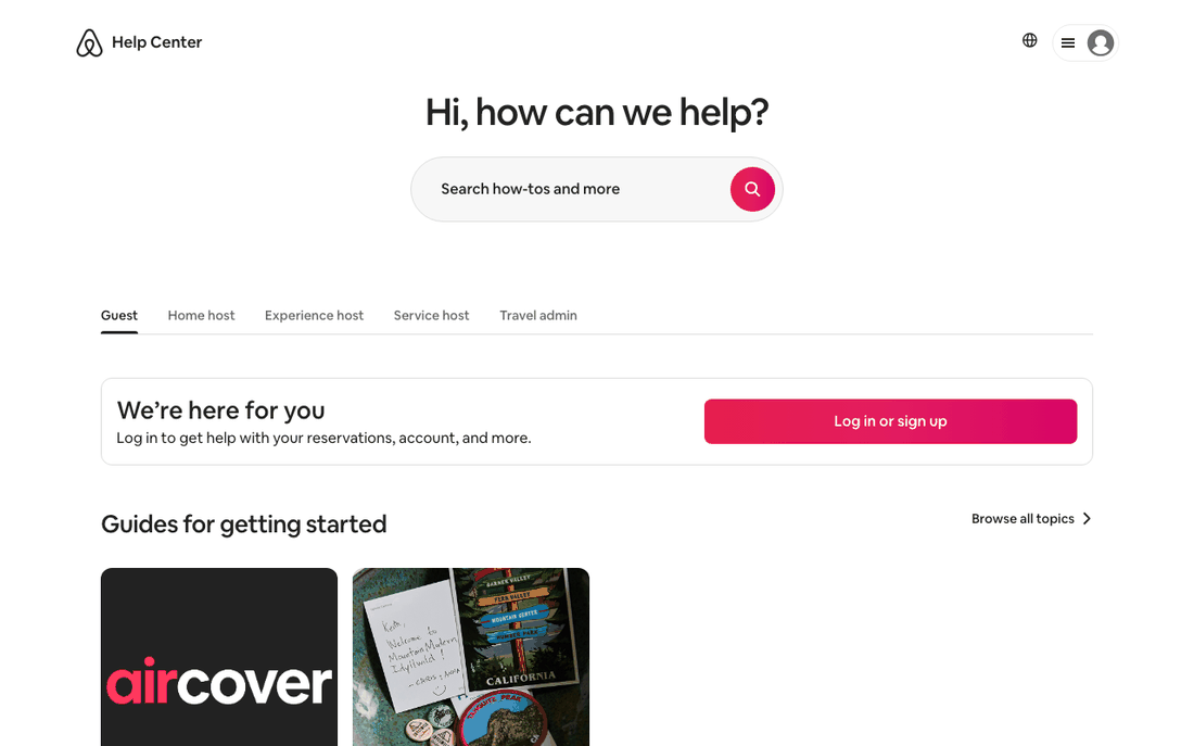
Airbnb shows a search box ("Search how-tos and more") and then five tabs: Guest, Home host, Experience host, Service host and Travel admin. A box says "We're here for you" and invites you to log in "to get help with your reservations, account, and more." Its "Top articles" start with "Cancel your home reservation as a guest".
The log-in prompt is the clever part. Once Airbnb knows who you are and which booking you mean, it can show help for your actual reservation instead of general policy pages.
Copy this: name each audience in your navigation. If your product has accounts, link from the help center to the in-app place where users can act on their own data.
Zendesk, HubSpot and Freshdesk knowledge base examples
If you are choosing a help desk, the vendor's own help center is the best demo of what its knowledge base can do. All three of these are built on the vendor's own product: Zendesk's uses Zendesk's /hc/ help center, HubSpot's page declares HubSpot as its generator, and Freshdesk's sits on a Freshdesk support portal.
13. Zendesk help: dated news on the home page
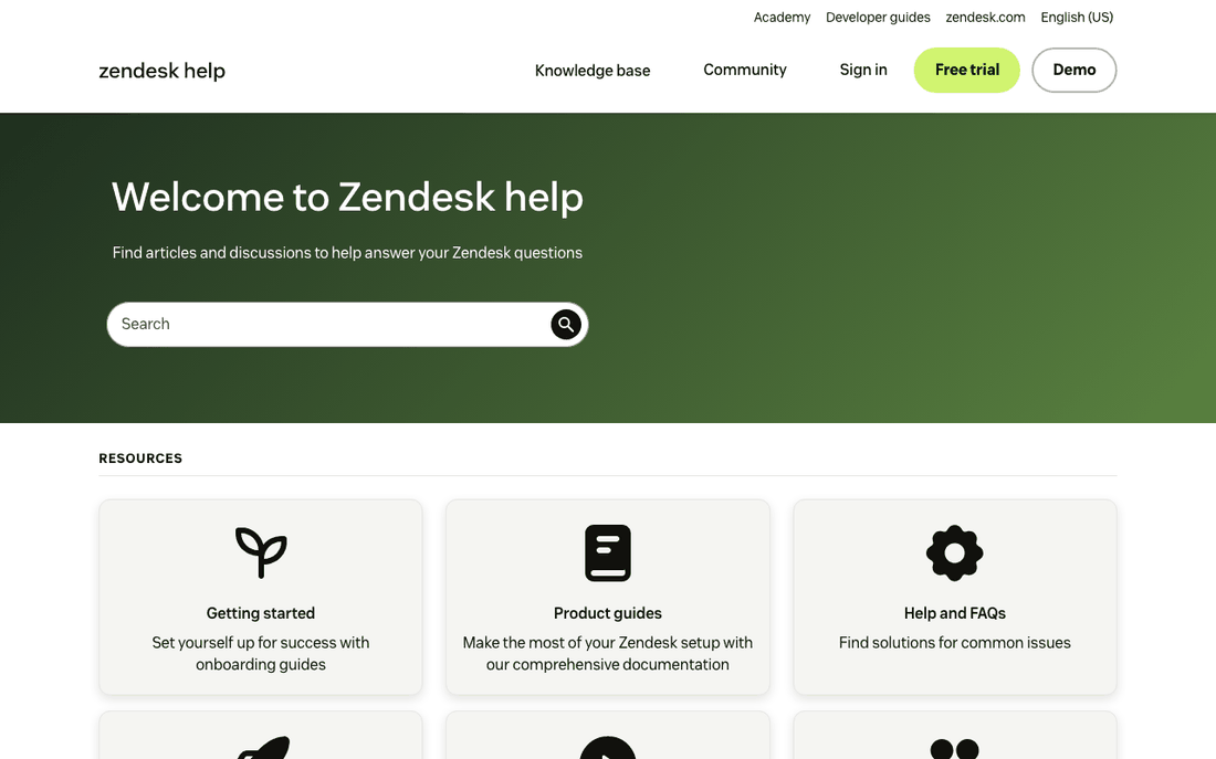
Zendesk's help center says "Welcome to Zendesk help" and organizes resources by intent: "Getting started", "Product guides", "Help and FAQs", "Best practices and how-tos", "Video" and "Community". A "News and updates" list shows announcements with their dates, such as "Edited Oct 15, 2026". Further down are "Role-based guides".
The dates do quiet work: they show the content is maintained, and they let an admin scan what changed since their last visit. Role-based guides are the vendor version of Airbnb's audience tabs.
Copy this: show an "updated" date on announcements and articles, and add a guide per role (admin, agent, end user) once you have more than one kind of reader. If you are comparing Zendesk with lighter tools, our Zendesk alternatives page lists options by price.
14. HubSpot: highest rated, not featured
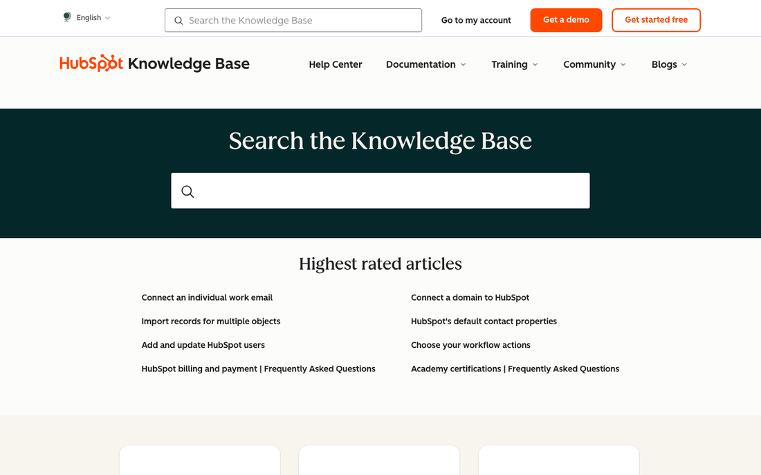
HubSpot's knowledge base is a search box ("Search the Knowledge Base"), a list titled "Highest rated articles" and a row of categories from "Account & Setup" to "Service". The rated list includes "Connect an individual work email" and "Import records for multiple objects".
"Featured" usually means whatever someone chose two years ago. "Highest rated" is chosen by readers, so it keeps itself current.
Copy this: fill your home page list from article ratings or resolution data, and review it monthly. KCS observes that "80% of the issues are solved by 20% of the knowledge base." (KCS v6), so a short, well-chosen list does most of the work.
15. Freshdesk: categories that say what is inside
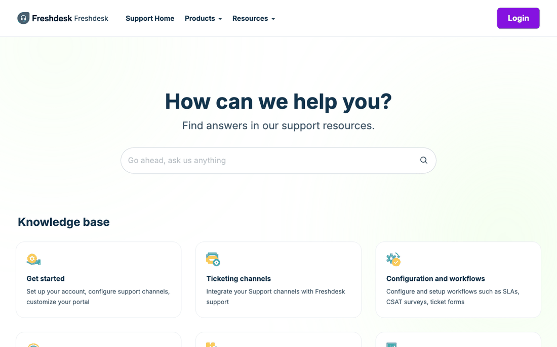
Freshdesk's support portal says "How can we help you?" above a search box ("Go ahead, ask us anything"). Its knowledge base categories each carry a sentence: "Get started" promises to help you "Set up your account, configure support channels, customize your portal". A "Quick links" block adds "System status" and "Release notes".
Like Intercom, Freshdesk explains each category in task language. The quick links answer the two questions admins ask most when something looks wrong: is it down, and did something change?
Copy this: link your status page and release notes from the help home page. If you do not have release notes yet, knowledgebase.dev has a free release notes template.
Internal knowledge base examples
An internal knowledge base answers employees' questions: policies, processes, who owns what. Most are private, which is why these three public handbooks are so useful to study. For the full setup, see our internal knowledge base guide.
16. GitLab: the handbook is the source of truth
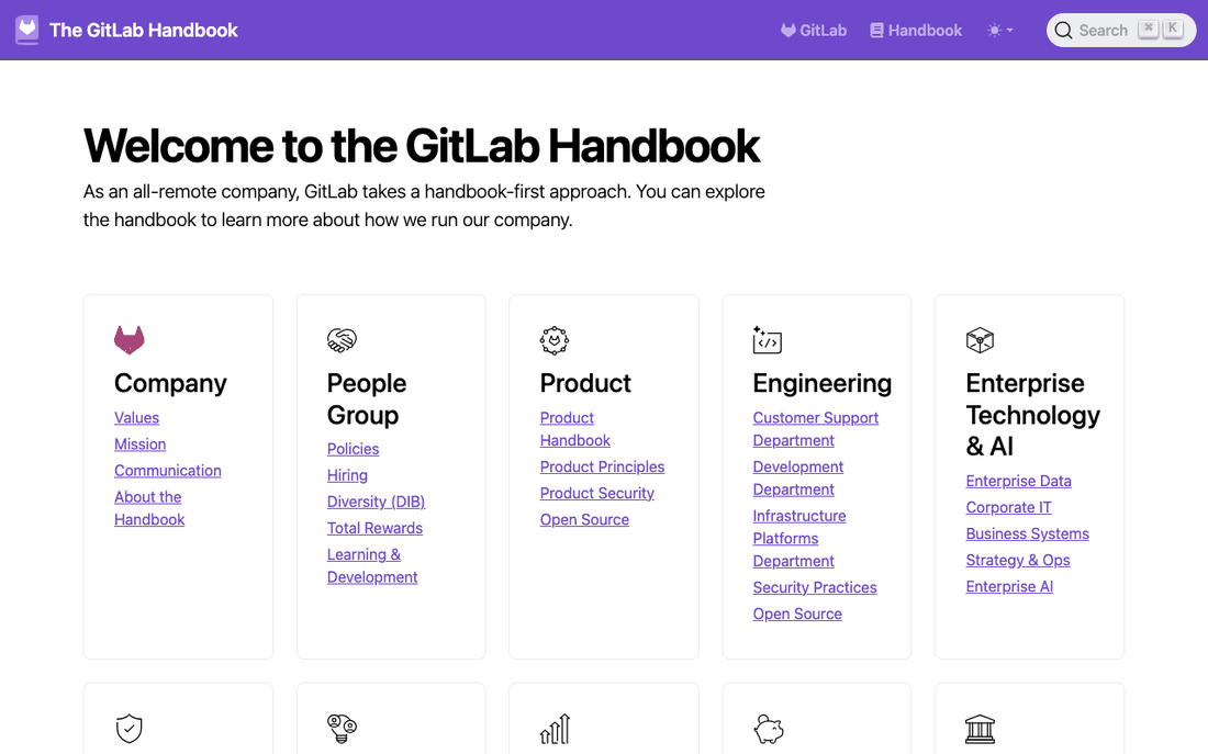
"As an all-remote company, GitLab takes a handbook-first approach." The home page groups the handbook by department: Company, People Group, Product, Engineering, Enterprise Technology & AI, Security, Marketing, Sales, Finance and more. GitLab describes it as "the single source of truth for how we operate at GitLab".
The habit worth copying is not the size. It is the rule that a process is not real until it is written in the handbook, so answers do not live in someone's head or a chat thread.
Copy this: pick one team and adopt the rule "if you answer it twice, write it down", then group pages by the team that owns them so every page has an owner.
17. PostHog: a handbook you can read in order
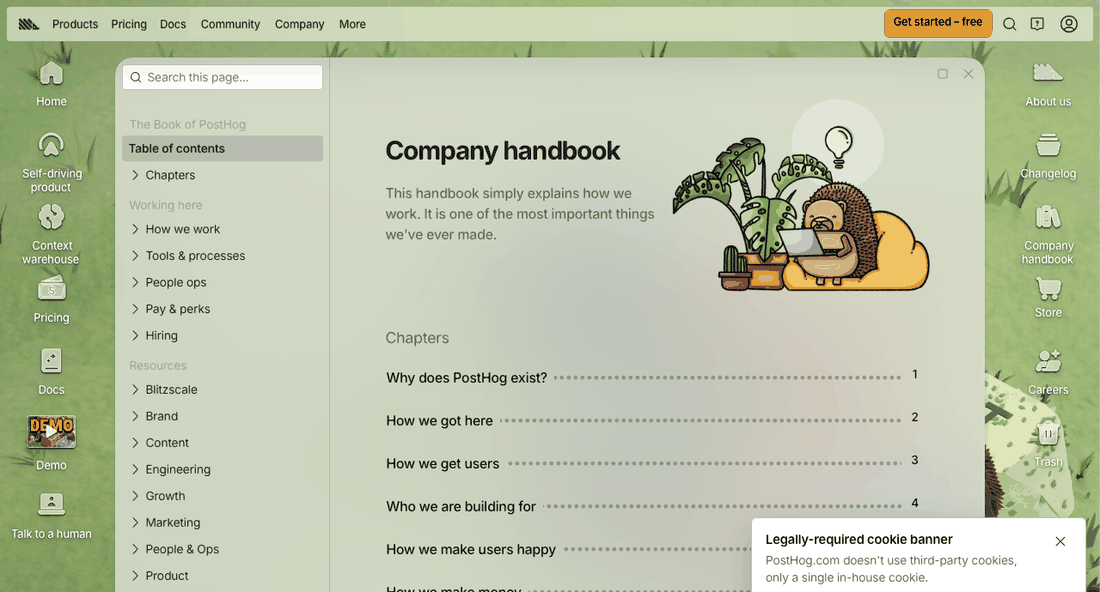
PostHog's handbook opens with "This handbook simply explains how we work." and then lists numbered chapters, starting with "Why does PostHog exist?", "How we got here" and "How we get users". A searchable table of contents on the left covers the reference sections, such as "Hiring" and "Pay & perks".
Most knowledge bases are only reference material. PostHog adds a narrative layer that a new hire can read front to back in their first week, plus the reference sections they will search later.
Copy this: write a short "start here" sequence of five to ten pages for new team members, in reading order, and link out to the reference articles.
18. 37signals: change history in public
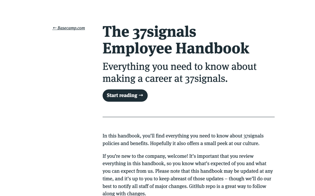
The 37signals handbook promises "Everything you need to know about making a career at 37signals." Its introduction warns that it "may be updated at any time" and adds: "GitHub repo is a great way to follow along with changes." The repository is public.
It is the only example here without a search box in the first screen, because it is meant to be read like a short book. The version history solves the problem every internal knowledge base has: people do not notice when a policy changes.
Copy this: keep a visible changelog for policy pages, even a simple "last changed" line with a one-sentence summary, and tell people where to watch for updates.
IT and service desk knowledge base examples
Service desk knowledge bases serve staff and students who need something working again, often in a hurry. They are less polished than SaaS help centers and worth studying for exactly that reason: they are built around volume.
19. University of Illinois: this week's top documents
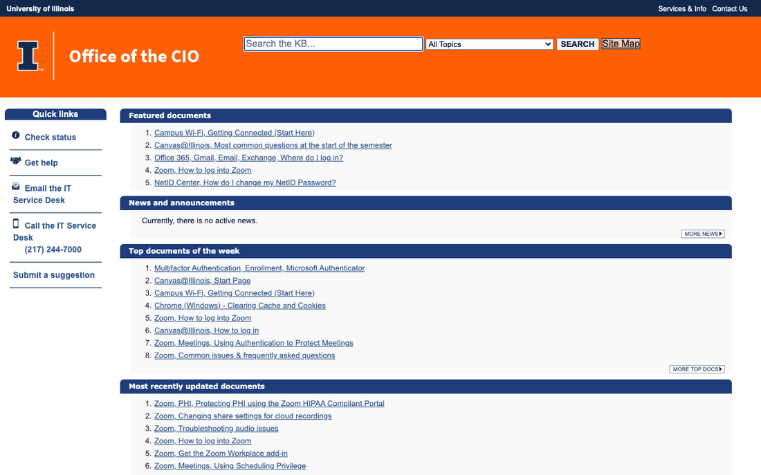
The Illinois Knowledgebase home page is a set of plain lists: "Featured documents", "News and announcements", "Top documents of the week" and "Most recently updated documents". Quick links on the left let you check a ticket's status, email or call the IT Service Desk, or submit a suggestion.
"Top documents of the week" is picked by usage, so it stays relevant without anyone editing the page: on the day we looked it included "Multifactor Authentication, Enrollment, Microsoft Authenticator" and "Campus Wi-Fi, Getting Connected (Start Here)". "Most recently updated documents" shows that the content is maintained.
Copy this: let usage pick part of your home page automatically, and show the most recently updated articles so readers can see what is current.
20. UW-Madison: one platform, many KB sites
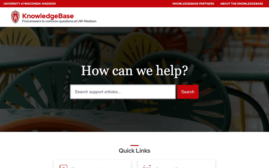
The University of Wisconsin KnowledgeBase opens with "How can we help?" and a "Search support articles" box. Its quick links include "Top support documents", "Explore KB sites" and "Request a new KB site", and the header links to "KnowledgeBase Partners".
Instead of one giant knowledge base run by central IT, the platform hosts separate KB sites, and a department can ask for its own. Each team owns its content, and the front door links them all.
Copy this: as you grow, give each team its own section or site with a named owner, but keep one search box across all of them.
What the best knowledge base examples have in common
Looking at all 20 side by side on the same day, a few patterns stand out:
- Search comes first. 19 of the 20 put a search or ask box in the first screen. The exception, 37signals, is a handbook meant to be read in order.
- The search box is never left blank. Slack, Canva, Calendly, Figma and Twilio all place real questions or popular searches right under it, and Dropbox puts example queries inside the box.
- Readers pick an audience early. Etsy and Airbnb split content by who is reading before showing articles, and Zendesk adds role-based guides.
- Usefulness is measured in public. Stripe shows how often an article solved the issue, HubSpot ranks by rating, and Illinois lists the week's top documents.
- A person is always reachable. Shopify, Stripe, Dropbox, Notion and Calendly all keep a contact route on the home page.
- Freshness is visible. Zendesk dates its news, Illinois lists recent updates, and 37signals publishes its change history.
How to build your own knowledge base using these examples
You do not need Slack's budget to use Slack's ideas. Here is a plan a small team can follow in a week or two.
- List your top 20 questions. Export the last three months of tickets or chats, group them by question, and count. Write those 20 articles first. KCS's 80/20 finding (above) means they will cover most of what people ask.
- Decide who is reading. One audience or several? If customers and partners ask different questions, give them separate tabs or sections like Etsy and Airbnb.
- Name categories after jobs and problems. Use the customer's words ("Files not syncing", "Why was I charged?"), not your feature names. Add a one-sentence description to each, like Intercom and Freshdesk.
- Put search first, and seed it. Show three to seven real questions or popular searches under the box. Refresh them monthly from your search log.
- Use failed searches as your writing list. KCS notes that "The words and phrases we use to search are potential content to improve an existing article or to create a new article, if one doesn't already exist" (KCS v6). Every search with no result is a missing article or a missing synonym. Our post on knowledge base search goes deeper. If your help center runs on HelpCenter.io (ours), the HelpCenter.io MCP server on Growth and Catalyst lets an AI agent such as Claude pull last month's searches that found nothing, check which ones your articles already cover, and draft the missing articles as unpublished drafts for you to review.
- Add a helpful vote and a human route to every article. The vote tells you what to rewrite; the contact link keeps people from getting stuck.
- Show dates and review on a schedule. Display "last updated" on each article and give every category an owner who checks it after each release.
When you measure the result, look at direction over time rather than single numbers. As KCS puts it, "it is the trends that are most important, not the absolute value" (KCS v6). Searches without results going down, and helpful votes going up, are the two trends to watch first.
Mistakes the examples avoid
- Feature-named categories only. Fine for people learning the product, useless for someone with a problem. Dropbox and Notion add problem-shaped entry points.
- An AI box with no warning and no exit. Twilio explains its assistant's limits; Shopify keeps a human one click away.
- A hand-picked "featured" list nobody updates. HubSpot and Illinois let ratings and usage choose instead.
- Undated content. When readers cannot tell whether an article is current, they open a ticket to check.
Start from a template instead of a blank page
Most of the patterns above can be set up in an afternoon if you start from a design that already has them. Disclosure: we make HelpCenter.io and Compass, so weigh our suggestions accordingly.
- Free, self-hosted: Compass on knowledgebase.dev is a free knowledge base template, open source under GPL-3.0, that you download as plain HTML, CSS and JavaScript and host yourself. It comes with six Markdown article blueprints and a launch checklist, and opens on a search-first home page.
- Hosted: on HelpCenter.io, the same Compass template is included on every plan and in the 14-day free trial, with no credit card needed. Plans start at $39 a month billed monthly ($29 a month billed annually), and Growth and Catalyst can host your help center in a subfolder such as yoursite.com/docs, like Slack's /help. AI answers are included on Catalyst and are a $29/mo add-on on Bootstrap and Growth. See pricing for the full plan list.
- For the articles themselves: our seven free knowledge base article templates cover how-tos, troubleshooting, FAQs, onboarding, billing, integrations and release notes.
Whatever you build on, copy the habits, not the look. A plain help center with real questions under the search box will beat a beautiful one organized around your feature list. If you are publishing for a SaaS product specifically, our SaaS knowledge base best practices pick up where this list ends.
Knowledge base examples: frequently asked questions
What is an example of a knowledge base?
Slack's Help Center at slack.com/help is a typical customer knowledge base: a searchable library of how-to and troubleshooting articles that customers use instead of contacting support. The GitLab Handbook is a well-known internal one, written for employees.
What should a knowledge base home page include?
A search box in the first screen, a few real questions or popular searches under it, categories named after what readers want to do, and a visible way to contact a person. Dates on news or recently updated articles help readers trust that the content is current.
What is the difference between an internal and an external knowledge base?
An external knowledge base, or help center, answers customers' questions about your product. An internal knowledge base answers employees' questions about policies and processes, and is usually private. The GitLab, PostHog and 37signals handbooks are rare public examples of internal ones.
Which software do these knowledge bases run on?
Zendesk's, Figma's and Etsy's help centers run on Zendesk, HubSpot's knowledge base runs on HubSpot, and Freshdesk's runs on Freshdesk. For most of the others the page does not say. 37signals publishes its handbook from a public GitHub repository.