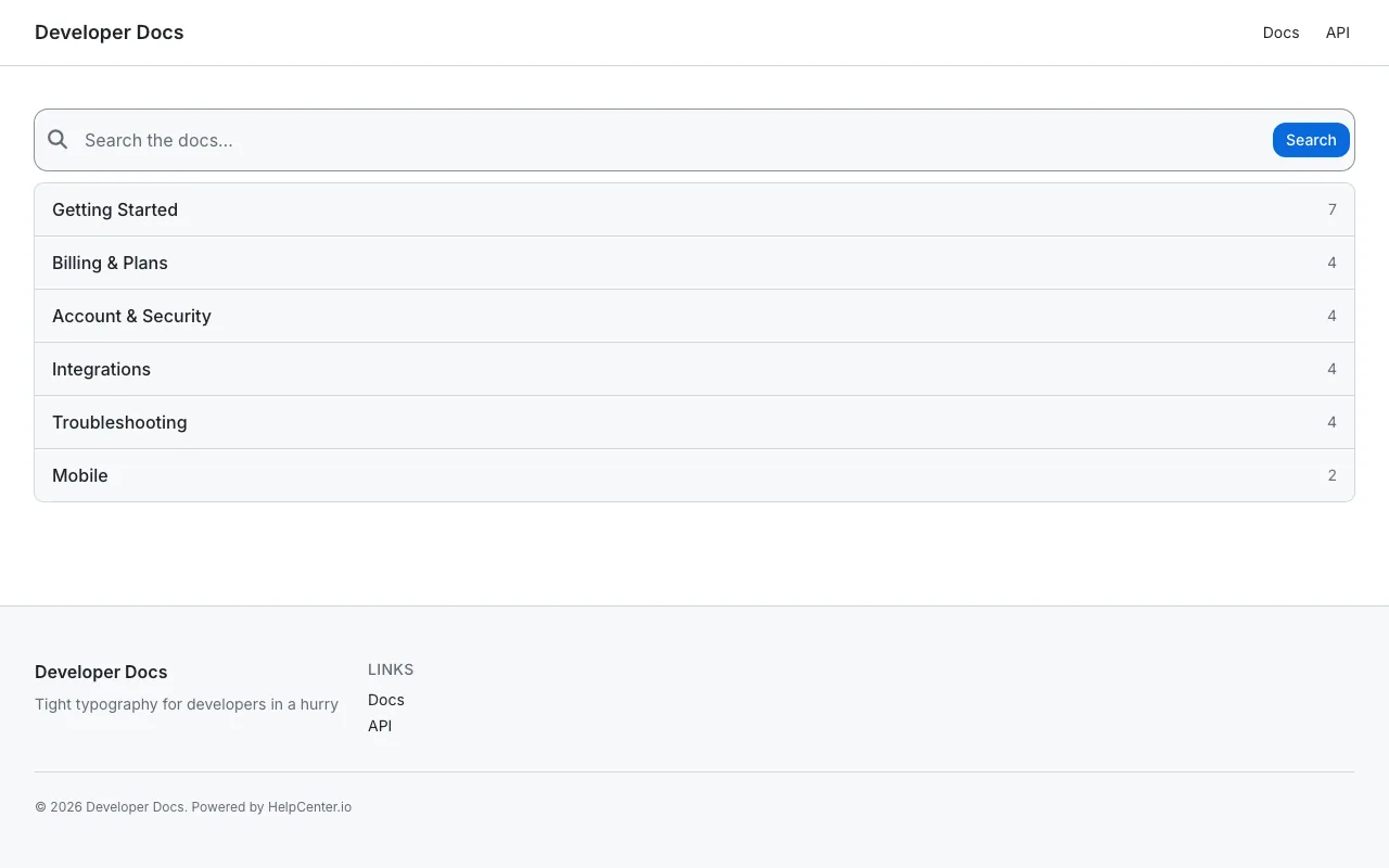
GitHub Dense
Information-dense reference docs built for a technical audience.
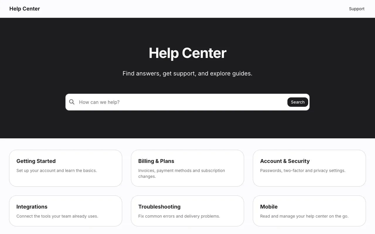
Apple Minimal is understated and premium: a text-only logo, a dark hero with one search box, six category cards and single-column articles.
Included on every plan, and in the 14-day free trial. No credit card needed.
Real screenshots of a demo help center running Apple Minimal exactly as it ships, before any changes. Pick a page to see it.
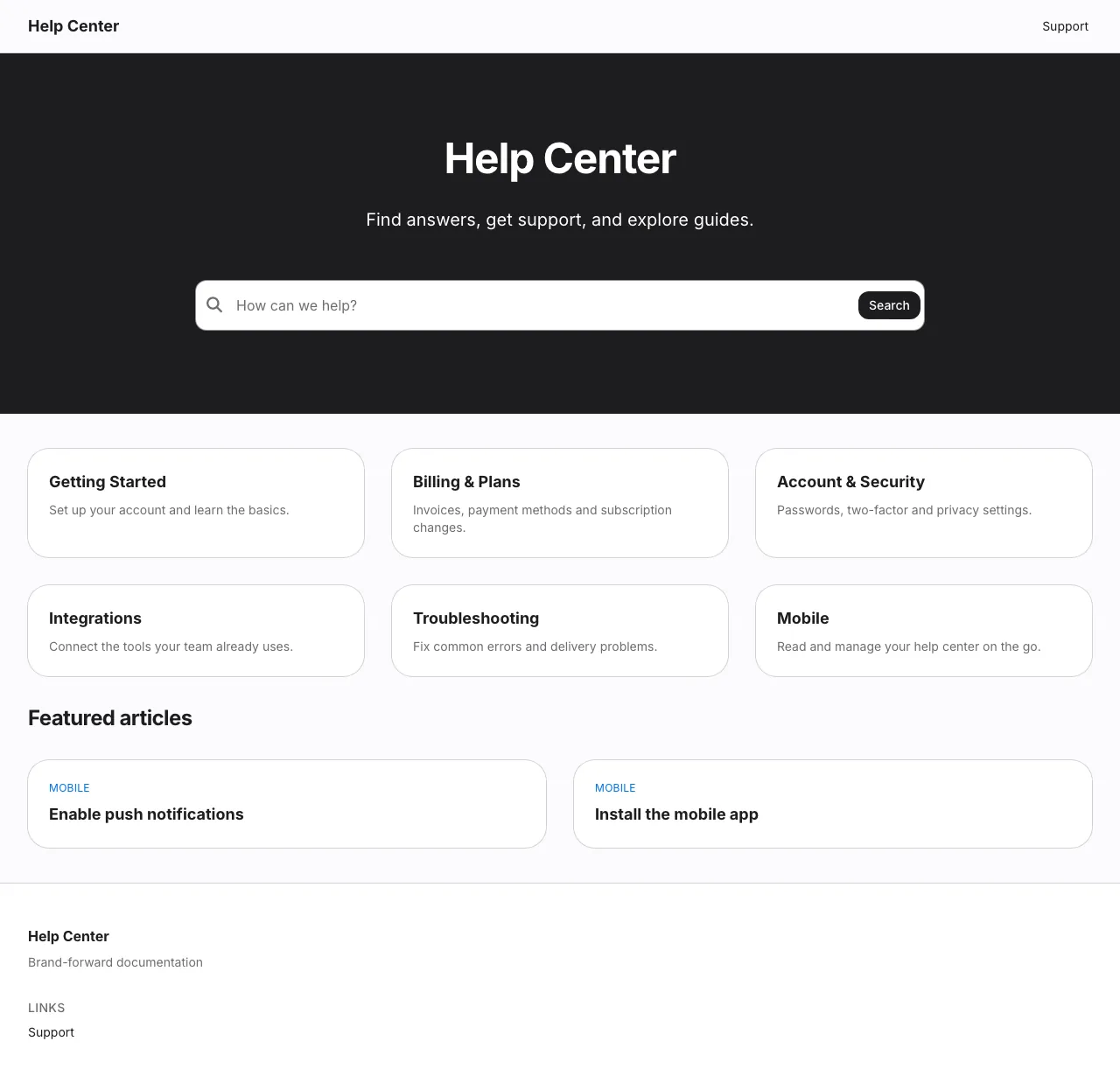
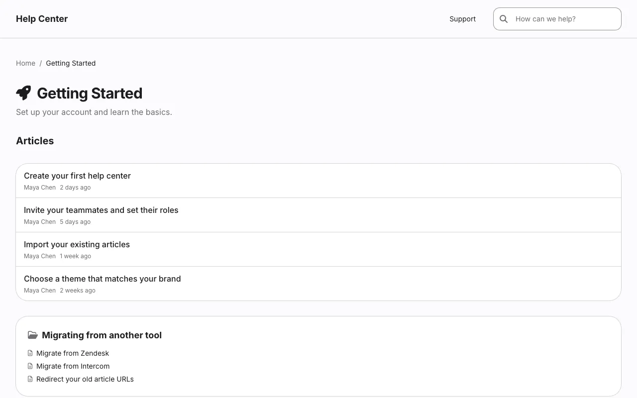
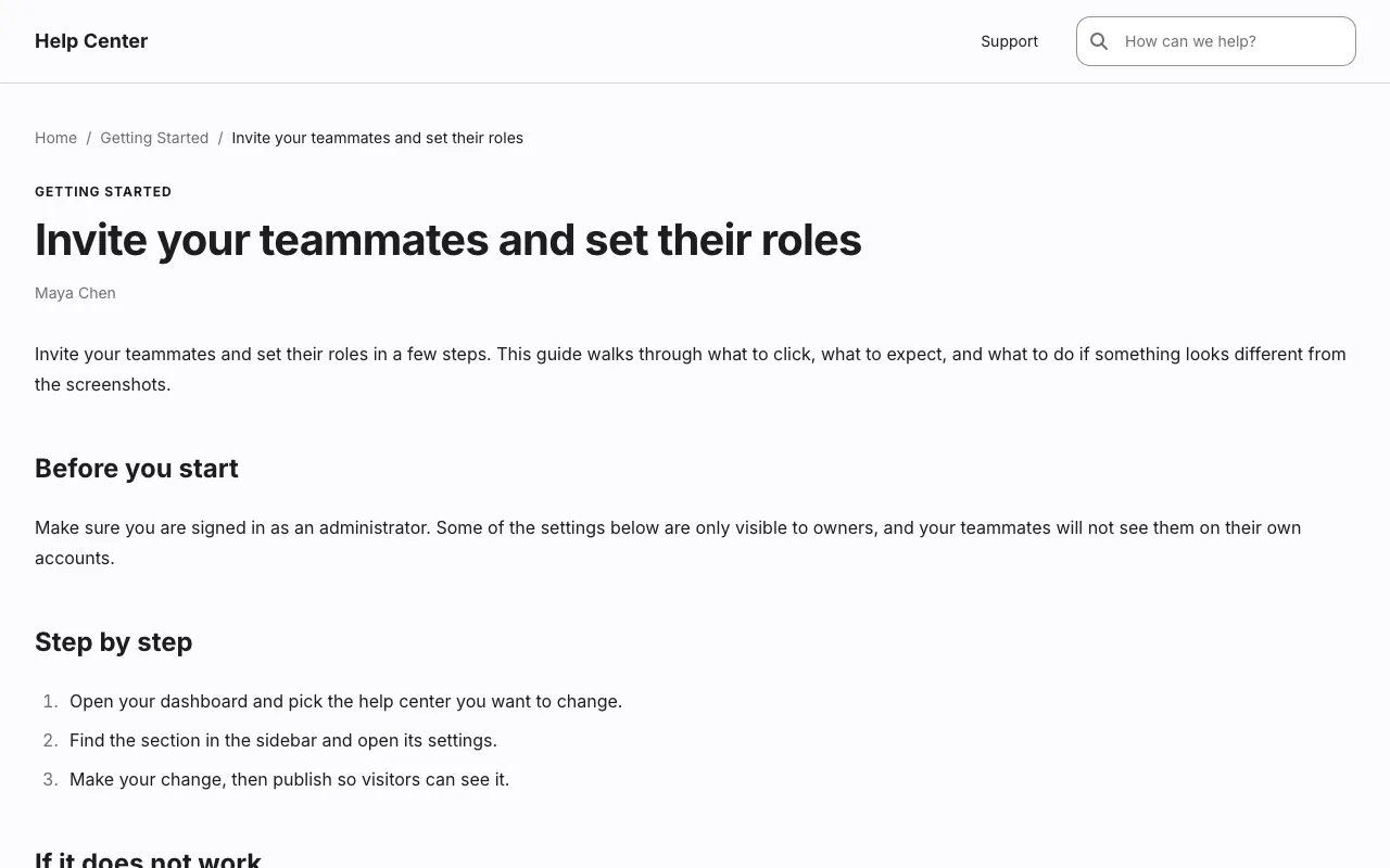
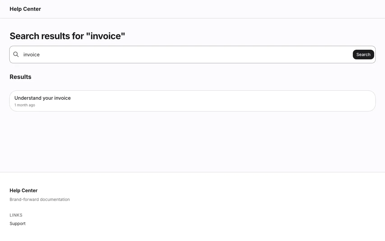
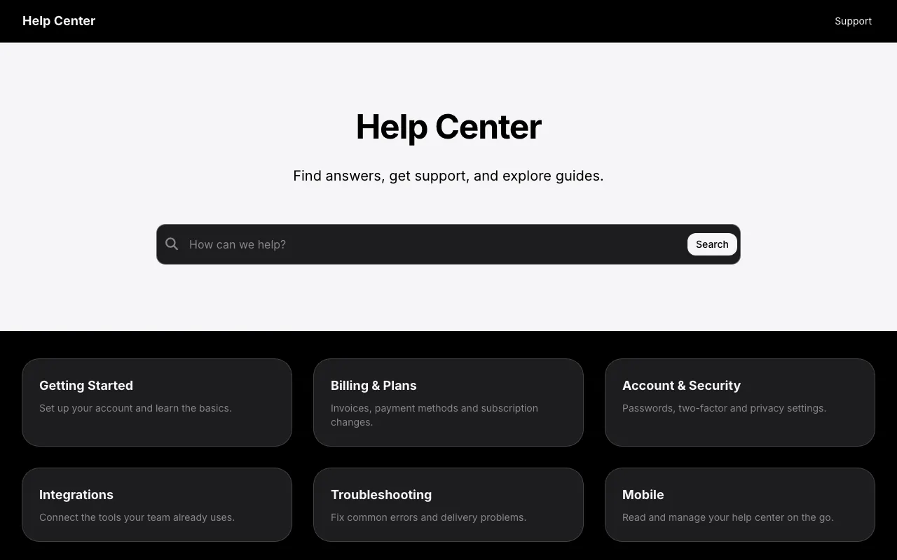
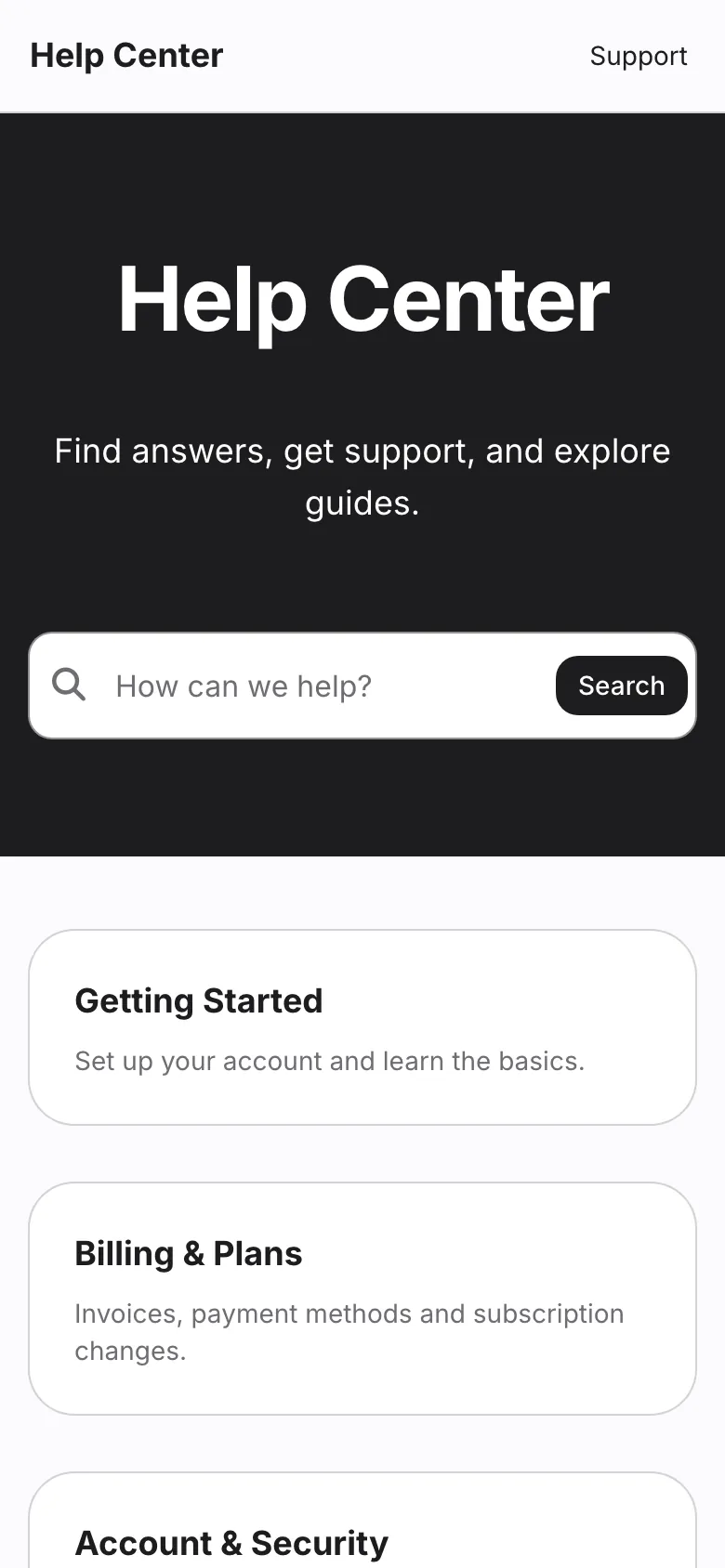
Apple Minimal strips the help center back to what matters. A text-only wordmark, a dark hero with a single search box, up to six category cards and two featured articles make up the whole home page.
Articles are one clean column, with a rating at the end and nothing else competing for attention. The spacious setting and a soft blue accent keep it feeling premium in light mode and in dark.
What Apple Minimal puts on each page before you change anything. Every section can be removed, reordered or added to in the editor.
Search results, contact and 404 pages are designed in the same style.
These are the settings Apple Minimal ships with. Each one is a control in the visual editor, and changing it restyles every page at once. Add your logo, use your own fonts, and add custom CSS when you want full control.
Start with Apple MinimalHeadings Inter
Body Inter
Light
Dark
Spacious
One of compact, comfortable or spacious, set for the whole help center.
Apple Minimal is included in every HelpCenter.io plan at no extra cost, like every template, and you can try it free for 14 days with no credit card needed.
Yes. Apple Minimal starts with Inter and #1d1d1f as its primary colour. Both are settings in the visual editor, along with your logo, the rest of the palette, the corner radius and the spacing, and changing one restyles every page.
Yes. Apple Minimal has its own dark palette, and visitors get it automatically when their device is set to dark mode. You can edit the dark palette separately from the light one, and add a logo made for dark backgrounds.
Yes, whenever you like, from the theme gallery in the editor. You compare the new template with your current design and choose which parts of it to apply. Your articles and categories are never touched, and nothing changes for visitors until you publish.
Yes. Apple Minimal is built to reflow on screens as narrow as 320px, and the editor previews desktop, tablet and mobile sizes before you publish. The phone screenshot on this page shows its home page 390 pixels wide.
Information-dense reference docs built for a technical audience.
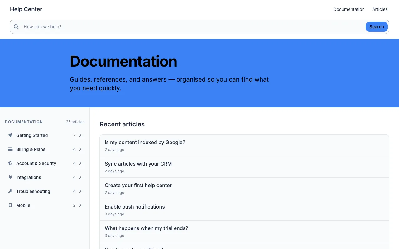
Structured guides and reference, organised for quick scanning.
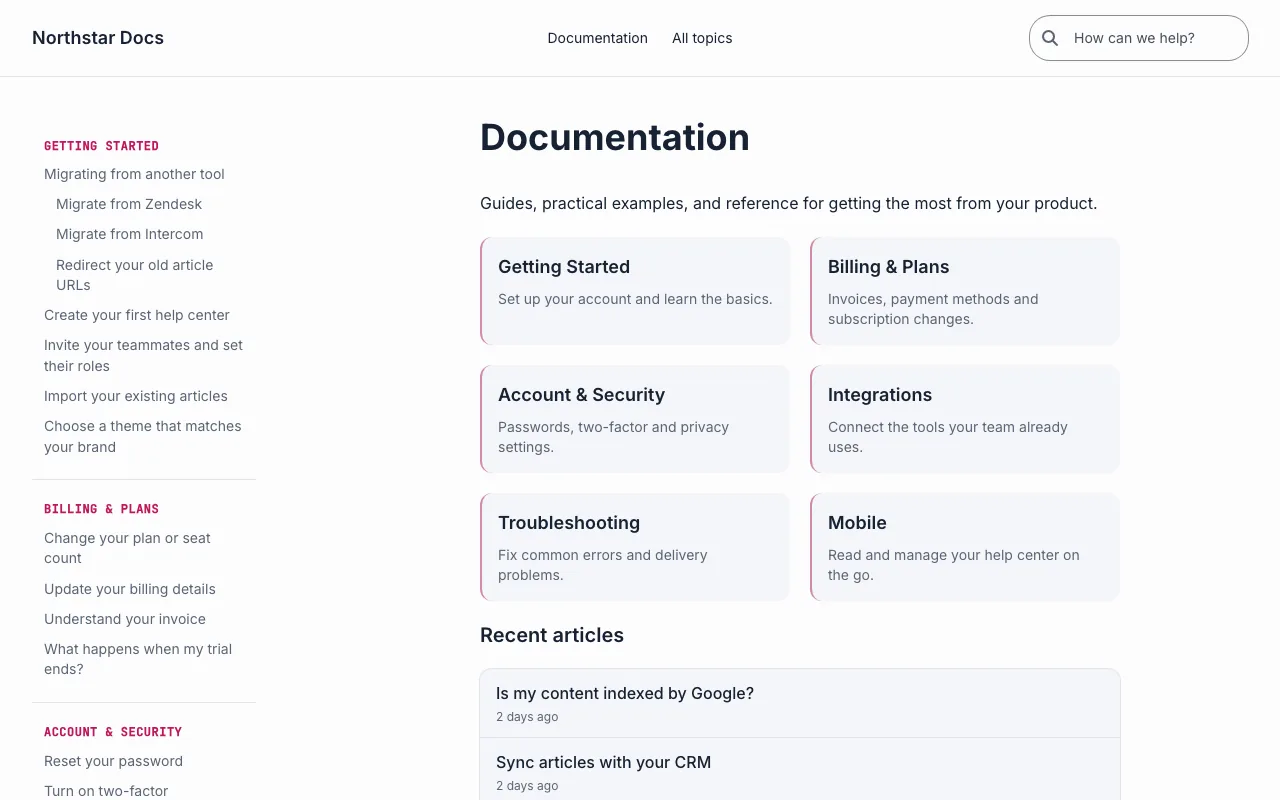
Centred navigation, grouped topics, and a comfortable reading column.
Your 14-day trial starts with Apple Minimal already applied. Make it yours in the editor and publish when it looks right. No credit card needed.
Help could not load. Open our help center.